
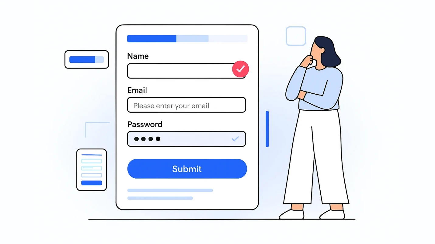
Forms are an integral part of the UX design process, but they’re difficult to design. They always have been. Even before the internet, paper forms caused difficulty. But having well-designed forms has become extremely important. A form can result in making a sale or gaining a follower. Here are nine best practices to ensure your forms don’t impede conversions.
1. Break up Forms into Multiple Steps

The last thing you want to do with UX design is overwhelm the user. If your forms cause anxiety and frustration, they’ll likely never be filled out and won’t lead to many conversions. The problem is many forms are innately overwhelming. There’s just too much information you need to get. That’s where breaking up the form comes in.
Taking a big task and turning it into many smaller tasks makes the experience seem more manageable. There are a few psychological factors at play here, but essentially, users just don’t want to sift through a giant field block.
When you break up long forms into smaller steps, it’s crucial to add some kind of progress tracker. If the user is presented with page after page with no end in sight, they’ll be more likely to leave. Providing a finish line gives them a goal to work toward and gives them a general idea of how long the process will take.
How you divide the form depends on the type of form. Generally, you want to group similar information together and provide the same number of fields in each section. You can test how different numbers and groupings perform for the best results.
2. Use Single-Column Forms

Keeping your fields in a single column is typically the most efficient form design. Users want to get through a form as quickly as possible with the fewest steps. And forms with multiple columns add more complication to the experience.
The reasoning behind this has to do with how users move through the page. With a single column design, they can start at the top and work their way down. With multicolumn forms, users have to jump all the way back to the top for each column — and that wastes time.
3. Make Forms Compatible with Autofill

Autofill is a profile with a user’s commonly used information. It generally includes data such as names, emails, addresses and credit card information. This feature is extremely useful for streamlining the form process because the user just has to choose which profile they want to use, and all the basic data is autofilled for them.
If your forms aren’t compatible with this service, you’ll appear to be behind the times and may lose conversions.
4. Inform the User with Summary Boxes
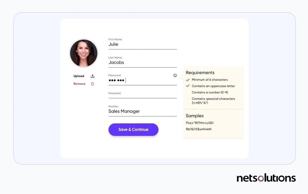
The user may want to know why you want the information you’re asking for. Summary boxes explain why information is necessary and what it’s used for. If users feel that you’re being transparent with how that data is going to be used, they may be more likely to finish the form, even when sensitive data is required.
You can also use required field reminders, titles and placeholder text to communicate with the user and keep them informed about the process.
5. Use as Few Fields as Possible

The more fields there are in a form, the more times a user has to spend engaging with your business. Streamlining your forms closes the distance between your company and the user. When designing forms, it’s important to consider the importance of a field. Take out any gratuitous fields you aren’t going to use.
One field that can almost always be knocked off is the phone number. Unless you have a specific reason to ask for it, it’s best practice to ask for email instead. Users are far more likely to provide contact information that doesn’t feel as personal as a cell phone number.
6. Put the Easiest Information First

This one makes use of a little psychological savvy: People are less likely to retreat when they’ve already committed time to something. They want to finish what they start, so a form that makes the process easy from the beginning may perform better.
Order your fields from easiest to hardest to fill out. That way, when the user gets to fields that take effort, they’re too deep into the form to quit. Information that users know off the top of their head, like name, email and street address, should come first, and fields that require the user to find information, like credit card numbers, should go last.
7. Use a Different Form for Mobile

Responsiveness is one of the most important attributes of a truly modern website. People aren’t going to power up their laptop and find your site again to fill out a form they first found on a mobile device. They’re just going to keep scrolling, so you need forms that are designed with mobile in mind. That can mean designing a form which transitions easily between mobile and desktop formats or using a completely different form setup for each.
Mobile forms must be legible on small screens, so consider using a minimalist design with large action buttons and fields. There needs to be enough room for people’s very imprecise fingers to select the field they want, or users may become frustrated quickly.
For further optimization, add automatic features and unique mobile tools, such as a credit card scanner. Ensure that either the keyboard or number pad appears for each field depending on what the data is supposed to be. For example, if the field is for entering a credit card number, a number pad should appear on the screen.
Check out this guide for mobile UX design in 2021 to modernize your mobile presence.
8. Opt for reCAPTCHAs

CAPTCHAs are the challenge responses that prove you aren’t a robot and involve actions like choosing all the pictures with cars or typing a word from a distorted image. If you use one of these challenge-based CAPTCHAs, your form may look out of date.
The modern security option is reCAPTCHA. Instead of trying to outsmart spam accounts with games, reCAPTCHA uses a risk analysis engine that assesses the legitimacy of a user. And the best part is, the user only has to click a button.
9. Favor Radio Buttons over Drop-Down Boxes

Radio buttons may take up more space, but they’re faster. Opening a dropdown menu and looking through choices takes more time than seeing everything at once. This is partially because of how users scan. They don’t need to read all of the options with radio buttons because their brain recognizes the appropriate response subconsciously, similar to finding a face in a crowd.
3 Form UX Design Examples
Looking at great form designs is a way to see some of these best practices in action. Here are three form designs that use UX design principles and practices to create conversions.
Net Solution’s Consultation Contact Form

This form makes great use of a user’s time with only five fields, making it easy for customers to contact us for consultations. The form also uses one of the latest forms of reCAPTCHA that doesn’t require the user to click a button. The form also transitions easily into a mobile view.
Snappet: a Questionnaire Form by Ricardo De Zoete

This questionnaire form design uses bright colors to make the process fun and keep the user engaged, and it lets users answer symbolically, which makes the process easier and faster. The real beauty of this form is adaptability. It works great on mobile and desktop formats with almost the same design.
Upart by Yifan Ding

Upart is a perfect example of how to break up forms. It uses an animated progress bar that tells the user exactly how many steps are left and makes them feel as though they’re moving forward with a zoom animation.
Get Help with Form and UX Design
Form design isn’t always easy, but it’s always important for user experience. Contact Net Solutions today to find out how we can help with UX design, including forms.