
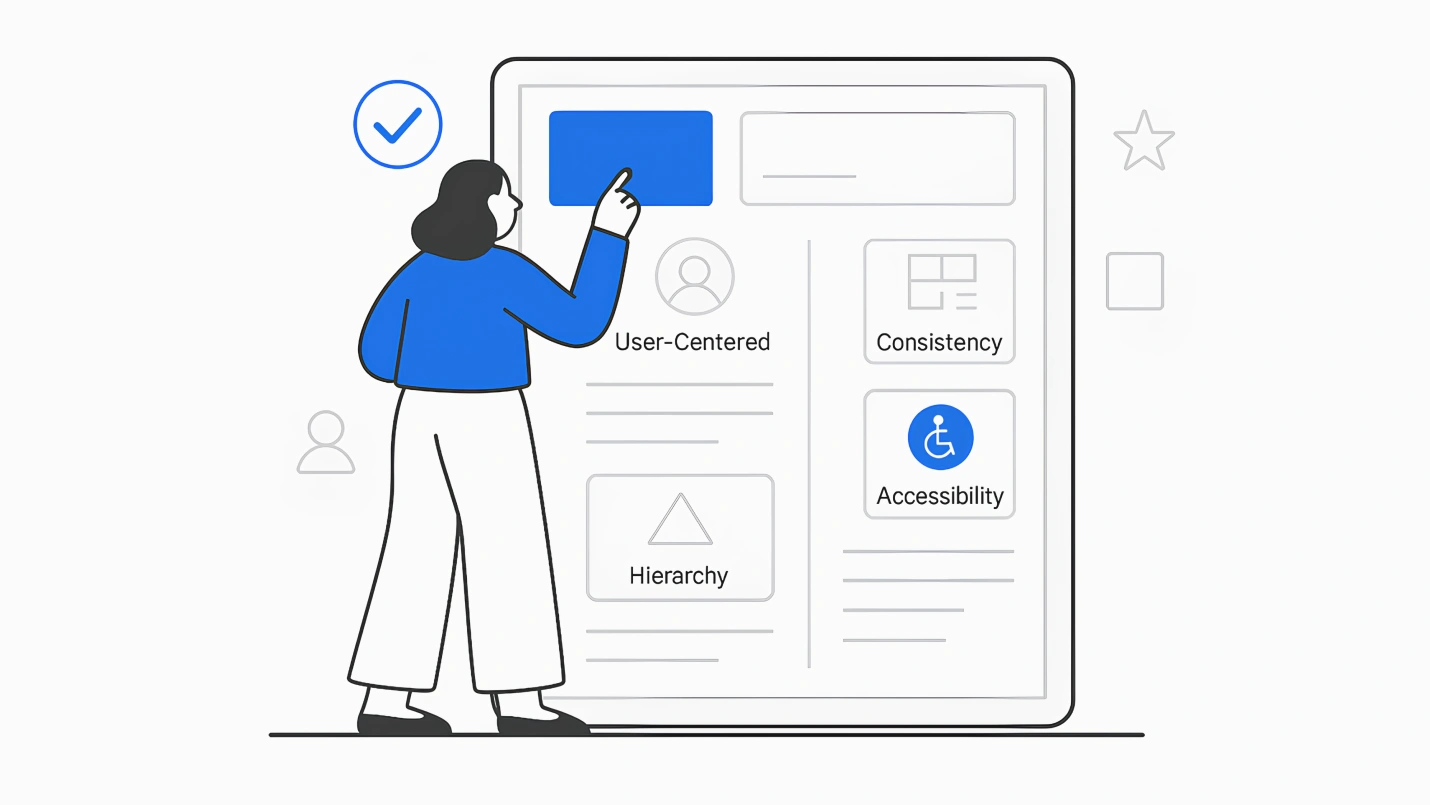
Summary: UX design is a creative and constantly evolving field that welcomes fresh ideas from new design practitioners. Still, some foundational UX design principles are the core of making your user experiences appreciated and successful among customers. This article focuses on such vital UX principles all designers must follow in their designs.
If you’re working on your digital product’s user experience, Here’s a cardinal rule – do not base your product on what customers say they want.
It’s really hard to design products by focus groups. A lot of times, people don’t know what they want until you show it to them.—Steve Jobs
But does that mean you don’t consider what consumers want? Instead, your job is to figure out what they’re going to require based on their actions. That is, experience design should not be solely about how it feels, but about how it actually works.
So, where is UX design taking us in 2026? Our UX experts combined which UX design trends are on their radar from advanced standards of adding personality to the doors of accessibility. But, there’s a lot more to look for in the top 11 UX design principles coming our way.
The design of a website or product plays a crucial role in the overall user experience. Various elements contribute to a positive user experience, including ease of use, efficiency, and aesthetics. By considering these digital experience elements during the design process, companies can create enjoyable and accessible products for customers.
11 UX Design Principles that Businesses Can’t Ignore
1. Put the User in Control
The desire to deliver very high standards for designers can result in complex designs for users to interact with and navigate. Putting users in the center stage to design user experience is often the most fundamental yet challenging design aspect. Designers fall short on digging into the user’s empathy rather than their own opinions. Exceptional good UX design is tailored to consumer pain points by avoiding personal preferences.
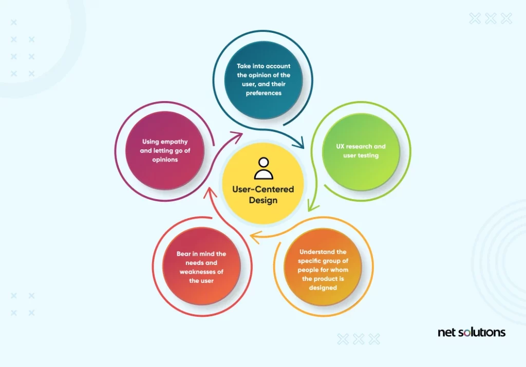
The user’s opinion, pain points, wants, preferences, and needs are crucial. It’s no wonder that design teams invest so much time and effort into getting to know users in the initial stages of the project.
How do Design Teams understand Their Consumer Pain Points?
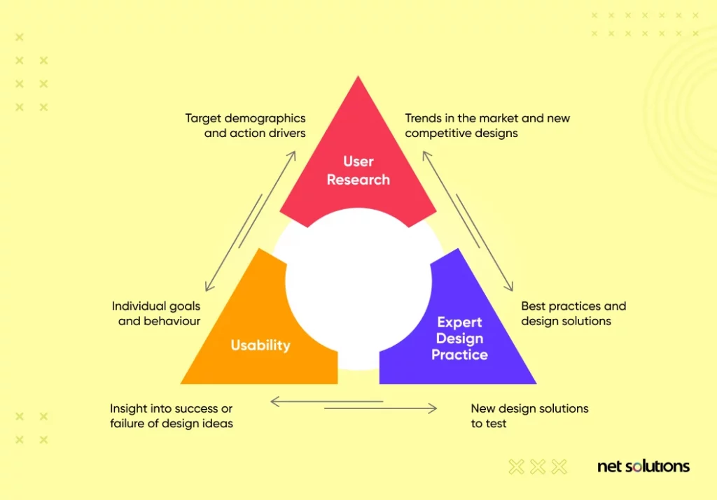
UX research specifically focuses on getting to know the user, setting the stage for everything that follows. User testing is another way to check how users respond to the design and see if their behavior is what the design team expected.
One thing is certain; the user has the final word in the UX world. Thus, you have to understand what the specific group of people needs and reflect on their lives in the digital product design. It’s highly targeted and deeply subjective work where everything is done for the user, with empathy being a top skill in the UX mix.
An excellent example of enhancing control is providing more advanced ways to improve efficiency. Keyboard shortcuts are a perfect way to do this, and templates let users perform repetitive functions more efficiently. Integrations between features and products can enable users to transfer content, and advanced searching helps users find what they’re looking for more efficiently.

We respect your privacy. Your information is safe.
2. Keep in Mind the Accessibility Factor
Accessibility is the concept of whether a product can be used by everyone—however they encounter it. Accessibility exists to aid people with disabilities and since product designers are designing products for a larger audience, the idea is to make products that accommodate all sections of people.
Product designers are responsible for web designs that eliminate any form of obstacles for any audience group when they use the product either temporary or permanent.
The Retail giant “Target” had to pay $6 million to plaintiffs with a promise to embed Target.com with code that makes it fully usable by blind visitors, to settle a class-action suit.
Here is a rundown of what you should have on any digital product to meet more inclusiveness in your UX designs:
- Bigger texts for Vision, dyslexia, and autism
- Bigger CTAs for Physical inability and vision weaknesses
- More White spaces for Vision impedances, dyslexic, physically disabled, and Autistic
- Utilization of sharp and dispersed lettering for Vision debilitations, Autism, Dyslexia
- Customer administration Chat or Detailed FAQ for Deaf and Autistic
Following accessibility guidelines improves the overall experience for all user groups since it steers the design wheel towards more usability:
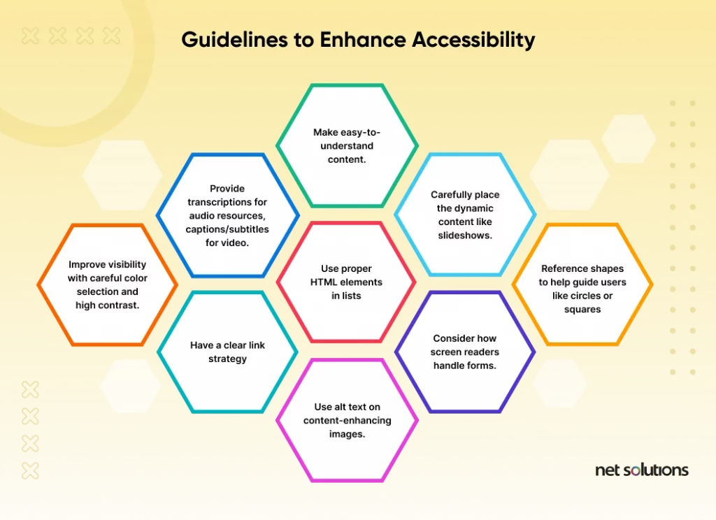
Here are three simple things to implement to improve the accessibility of digital products and websites:
- Colour and Contrast: *Poor color choices can make finding, reading, and understanding information complex for many people.
- Screen Readers: *When designing, consider how a screen reader would interpret your design and content.
- Keyboard accessibility: *Using a mouse is not physically possible for many users who need to navigate a website using just their keyboard.
3. Ensure a Well-organized Information Architecture
Information architecture is the method of organizing and labeling websites, software, etc., to ensure their usability and findability to help users effectively locate information and complete tasks. It helps build a structure that connects content with the functionality of the web platform.
Information architecture is the way that we arrange the parts of something to make it understandable.-Abby Covert, How to Make Sense of Any Mess
Businesses tend to avoid restructuring their websites, sometimes because it demands additional efforts, while it might seem a better deal to copy structures of existing websites. Either way, you are losing out on business.
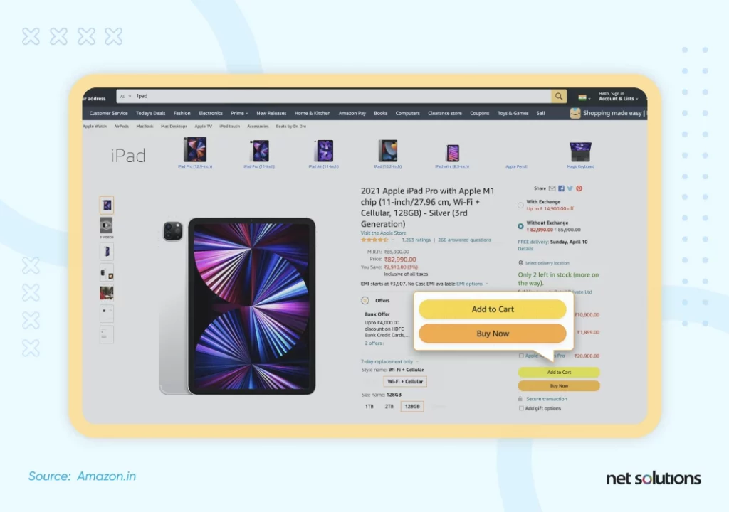
A great example of taking the edge was Amazon’s major UI change that might look under the radar of most but was a huge win by suddenly Making Their Buttons Flat.
The following four components need to be embedded for a well-defined information architecture UX design.
- Organizing Structure: It defines the way you organize, categorizes, and structure information.
- Website Labeling: This pertains to the art of presenting information in a simplified manner.
- Easy-to-go Navigation: The ease of browsing and finding a way to the intended information.
- Improved Search Systems: An improved search system defines the way users seek information.
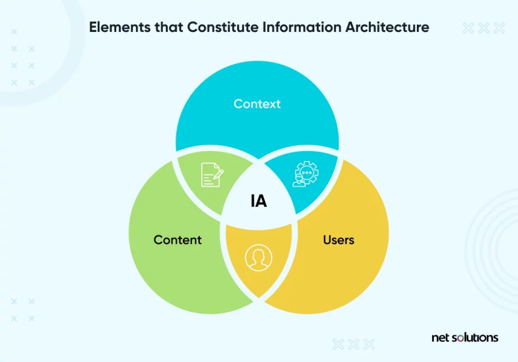
Here are the three elements of information architecture that help create the best user experience design:
- Users: Involves the target audience, who are looking for specific information on the platform. To start with, you can also design the user experience of your MVP for some useful insights.
- Context: This narrows down to the information and its relevance that you provide to the target audience. Make sure that the message you are sending out to the audience is loud and clear.
- Content: Here you would have to ensure that every element of content, i.e., text, images, icons, and videos work in a unified way to engage the customers at every touch-point.
Information architecture UX is the center of a digital product that helps ramp up the SEO efforts and build better sitemaps.
4. Have a Clear Hierarchy
It is easy to take hierarchy for granted, but this UX principle ensures smooth navigation throughout a design. One of the most critical user experience elements is the navigation of a website or product. If users can easily find what they are looking for, they will likely become frustrated and leave the site. Therefore, designing a clear and intuitive navigation system is essential to improve the user experience.
Here are the two primary hierarchy principles you need to follow:
A. Hierarchy Associated with the Content Aligned with the Design
For example, when you open a website or app, you will note the main sections’ navigation bar. When you hover over the “main section” bar, you shall notice the subcategories would pull you deeper into the app or site to take the final action. This is a chief hierarchy principle.
B. Visual Hierarchy
The visual hierarchy guides the users to glide smoothly within a page or section. To help users take the essential next step, you need to place the vital content prominently to help it stand out.
Take our website’s example for the same. We display the main message using a large font to help it stand out followed by a “Read More” button to encourage action. Following such a visual hierarchy ensures visitors are never confused on our website and they get what they want.
5. Maintain Consistency
Users expect consistency with similar products they’ve been using in the past. The more familiar your user is with the product, they’ll interact better with it. This saves time and effort for designers since they don’t have to redesign every user interface element.
The visual design should be visually appealing and consistent, creating a cohesive experience for the user. This is a paramount user experience element for the appearance of a website or product. In addition, the layout and spacing of content can also impact the user experience. By paying attention to these details, designers can create a product that is aesthetically pleasing and easy for users to interact with.
While it might be alluring to try something new, the principle of consistency (and tons of research!) tells us you’re better off sticking to standard patterns for most things.
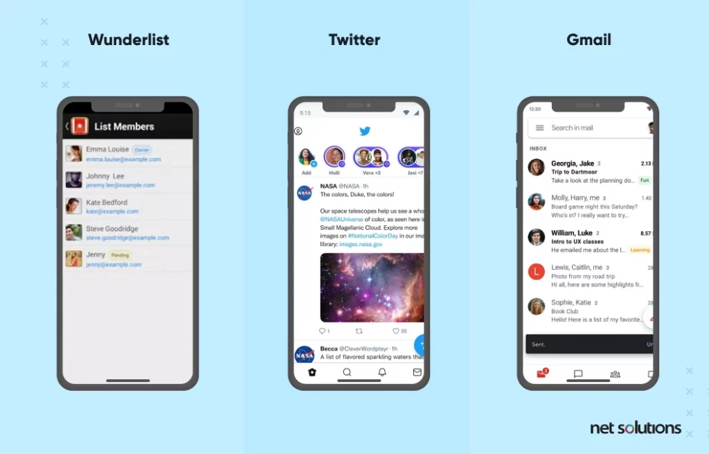
These three apps all use a Floating Action Button (FAB) at the bottom right corner to make it easy for users to accomplish the necessary action available on this screen.
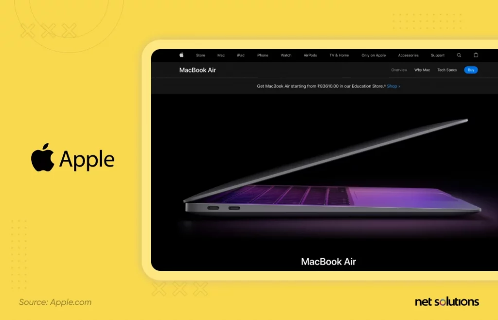
6. Less is More in UX Design
The architect Ludwig Mies van der Rohe was the first to propose the “Less is more” design principle. Since working intensely to deliver more impressive and creative designs might lead to unintentional clutter on the interface or the product. It, therefore, focuses on prioritizing simplicity with a unique eye on usability and consistency.
You are most likely to distract your user from completing the ultimate action on the website, like finishing a purchase by adding unnecessary jingles to the website.
The less is more approach focuses on simplicity and aesthetic design interface instead of over-decoration of the interface.
For example, Apple streamlined the iPhone’s keyboard following the less is more UX design principle in 2007, just like Apple’s website.
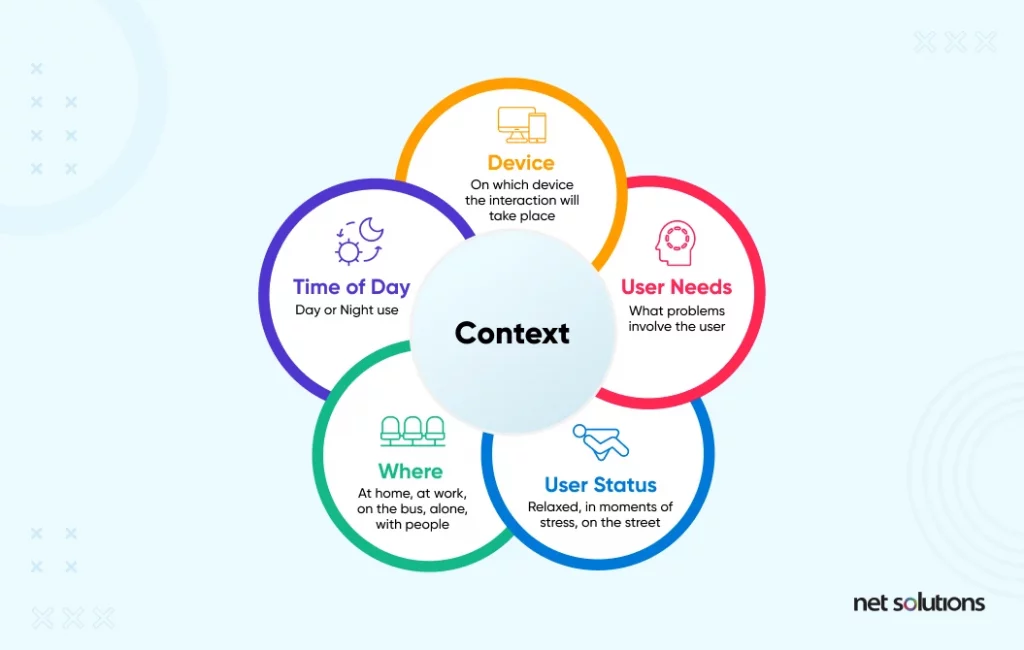
7. Context Remains the King for Designers and Users
UX design is a people’s industry thus, “context” is essential around everything. In fact, no design principle will be influential without context.
Invest time in understanding the user in the right mindset of putting the user in the design center. The initial step of understanding user context is regularly comprehending their challenges.
Following contextual factors play a significant role:
- The time available for the user, the device they are using
- Users’ emotional state and requirements
- The time of the day user is accessing the design
- Whether the product is for a user sitting at the desk or someone on the go
These elements are fundamental in understanding the user’s behavior and anticipating their interaction with your interface. You can prepare a design that blends all the factors to maximize the user experience.
For example, a user’s emotional state would influence how patient or impatient they might be when interacting with your product or service user interface; thus, design your interface by keeping that in mind.
8. Use Simple Language for UX writing
Retaining your users in the fast-go online surfing is already a challenge. Your users are busy and already distracted with zillion of options for the same product, and they’re probably juggling several tasks while quickly scanning your website/application. At this time, using words that are closest to your user’s thoughts would help them relate to your design and not skip it. And with words most relative to your user’s thought, we certainly don’t mean the “Shakespearean” vocab.
Your visual design copywriting should avoid technical terms and choose the simple language that your users can quickly grasp and relate to.
It’s easy to understand, plus it adds bonus points for your design’s friendliness.
These five factors will help pick how you should go about your user design-
- User Design’s Audience and Purpose: Predefine your audience and their user design preferability. Analyze the gaps in their consumption and how they like to be communicated.
- Structure: Consider your communication’s standard structure that best relates to your audience’s mind and makes their activity process easier.
- Expression Use action verbs to prompt action instead of confusing adjectives. Consider the tone sentence length and carefully pick the words to use.
- Design layout: focus on the typography, layout, and information graphics
- Evaluate: It’s natural to feel confident and biased with your designs and language; therefore, have another teammate review the text and run a usability test.
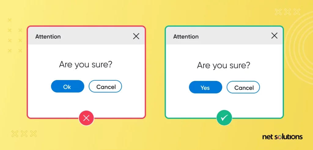
In simple words, follow the three Cs- Clear, Concise, Consistent words throughout your design to reduce ambiguity.
For example- the Ok in this image here is confusing; thus, replacing it with “Yes” would be a more logical and clear choice!
9. Typography is Powerful
Steve Jobs wanted a computer Interface as pretty as the calligraphy on his college campus posters. Today, designers and marketers alike have nearly unlimited fonts and creative user interfaces for our digital devices.
In a world where designers have nearly unlimited fonts and creative user interfaces for their digital devices, Typography is another influential factor that impacts your UX design copywriting in the most consistent form.
In his book, Robert Bringhurst, the author of “The Elements of Typographic Style,” mentions the impact of typography in the UX design principle.
Typography in the UX designs can influence how the user interprets your language and thus improve or suppress the message you’re trying to convey. Therefore it can impact your UX in several ways like more accessibility and user-friendliness when you consider a typographic hierarchy. It thus makes up for a significant trend to consider in your User Experience design checklist.
10. Add Personality to Your Designs
Given a significant segment of the modern design consumption is the GenZ and millennials, personalizing your designs can add profound brownie points to your overall design efforts. The modern internet user might find connecting with a lifeless design, device, or code quite challenging. Therefore personalizing design experiences will help you cater to more audiences by breaking the ice in between and making a hot topic if it highlights a character that interests the user persona you are designing for.
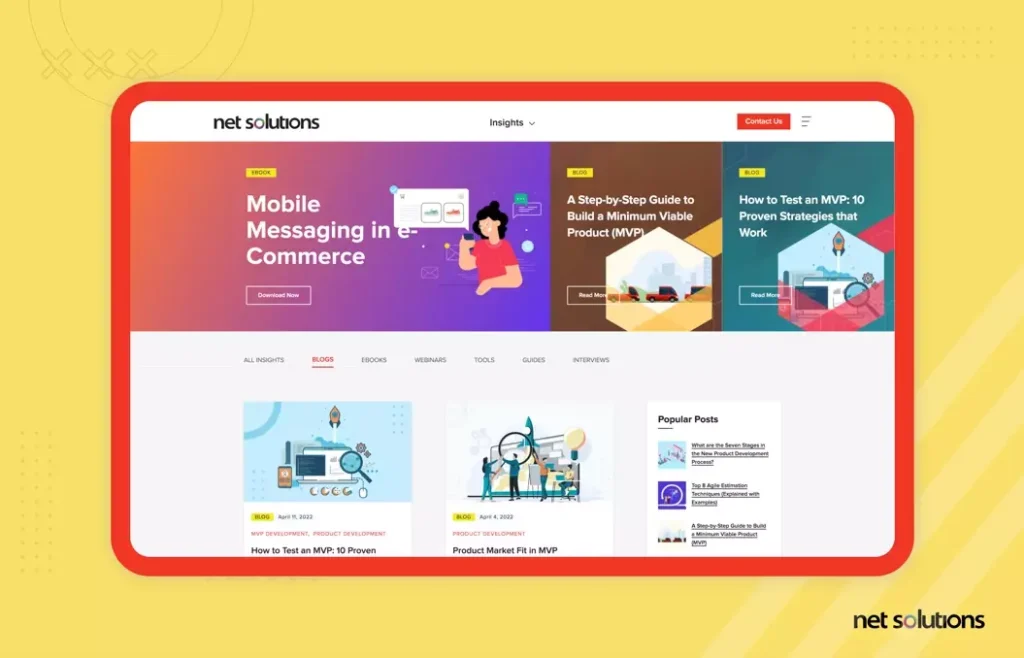
It’s all about the human touch in digital products. The Trello Blog is making a good example for highlighting what type of audience it serves.
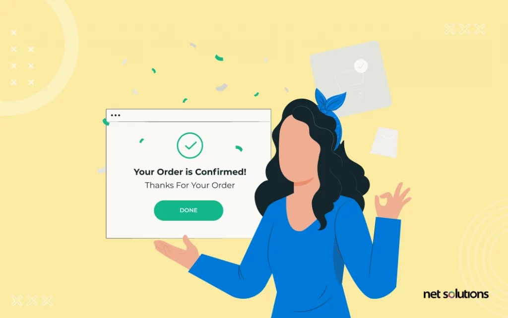
11. Leverage Confirmation and Feedback
“When you design a system, an application, a website, it is important to keep in mind that each action performed by the user requires a reaction from the system. It is very important to always keep the user informed, providing them with the right feedback, at the right time.” – Jordane Sanson
Once your user navigates through your product and finishes a task, they must receive completion feedback.
Suppose it’s their first interaction with your payments application; if a feedback/confirmation pop-up doesn’t appear after the transaction, it can leave the consumer confused and distressed only to avoid a second interaction with your application. You must be conscious of providing that feedback and confirmation to your users as you are designing.
Google Pay’s successful transaction window is an excellent example of letting your users know their task was completed without interrupting the experience.
Frequently Asked Questions
Following are the key elements of a UX design:
- A Well-organized Information Architecture.
- Interaction Oriented Design.
- Usability Aligned Design.
- Visually Appealing Design.
- Planned User Research.
- Trello, a popular task scheduler that leverages an intuitive interface to ensure that customers can use it even without experience.
- Duolingo, a language learning platform that uses gamification and an intuitive user interface to make learning an interesting task.
- Apple, a leading tech-giant that has the hearts of millions with the simplicity of its products.
- MailChimp, a popular marketing automation platform that makes email marketing easy for everyone with tips and handy templates.
A UX design helps in laying out a basic overview of what should go on the screen. The end goal is to reinforce the Key Performance Indicators like engagement, adoption, and task success in your mobile app.
A visual design, on the other hand, lets users see elements like controls, menus, buttons, and the area of your app where they perform an action.

