

Summary: Design is a science as it is an art. Using the correct elements in sync with consumer psychology can effectively back your business goals. Dashboard design is more than just how well you can arrange data. It involves getting people to interact with brand information. This article will help you design or redesign your dashboard UI to assist users in understanding the key pieces of data.
We live in a highly dynamic world, mesmerized with smart technologies and flooded with various forms of structured and unstructured data that are the key drivers of every form of business. Real-time data analytics and data visualization are not just a must-have for contemporary enterprises; the lack of these can be catastrophic for your business altogether. This is where the importance of dashboards with great UI designs comes into place.
Why is it essential to have a good dashboard design?
Because it speaks volumes about how much you care about solving your users’ problems. Keeping in mind the rapid advancements in the fields like big data, artificial intelligence, etc., that underline the massive use of complex algorithms, it is bliss if every piece of data can be analyzed and visualized on a dashboard.
“A User Interface is like a joke. If you have to explain it, it’s not that good.” – Martin LeBlanc
Let’s look deeper.
The Key Elements of Real-Time Dashboards
Designing interactive real-time dashboards is not a fluke. An in-depth analysis of the business functions along with the key dashboard UI elements as listed below should be used to make a perfect one:
- A simple design that is devoid of overcrowded information
- A dashboard UI design that enables human-friendly communications
- Fewer distractions will allow for better overall interaction
- Ability to represent significant and valuable information on the go
- Easy accessibility, which makes for a wonderful dashboard UI
While designing an interactive dashboard, blending the features mentioned above with the following practical dashboard UI design tips is one of the best strategies.
The Indispensable Tips for a Quality Dashboard UI
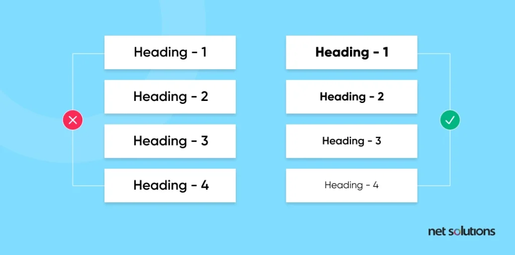
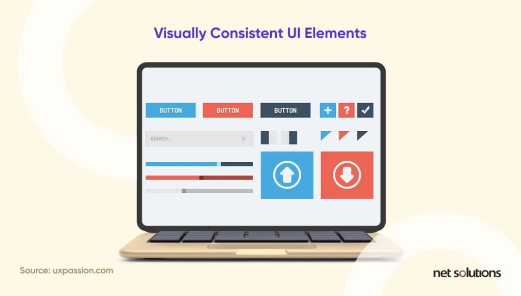
1. Maintaining Consistency is the Key Rule
One thing is for sure, lack of consistency is likely to lead to a lack of interest! Enterprises that wish to keep up with the consistency standards, it becomes even more, takes this design principle seriously.
Maintaining consistency is equivalent to drafting an intuitive design. It is a design tip that maintains a natural flow of information and actions without making the users head south.
Precisely, you need to take care of the visual consistency of the design. Everything together makes for a consistent design, be it the fonts, interoperability, compatibility, theme, placement of elements, or navigation.
The illustration demonstrates the difference between good and bad consistency in the dashboard UI.
Add-on tips for working on the visual aspect of a dashboard UI UX:
- Maintain a consistent color palette all across the dashboard
- The style of charts should be consistently followed throughout
- You should not give consistent labeling a miss
- Similarly categorized data should maintain a consistent pattern
2. Emphasize the Comparative Analysis
Differentiating one piece of data from another should be a natural process altogether. Thus, it comes as an added responsibility to represent information in a way that the user finds it as easy as ABC to derive insights from visually flowing data.
Here’s the thumb rule: Do not adjust a plethora of tabs or long scrolls in an attempt to fragment the information. Even if you wish to go ahead with scrolls and tabs, it needs to be done cautiously while maintaining the cleanliness of the design.
Implementing a compact design that accommodates all a user seeks might seem challenging, but it is your only chance. Either the users will be pulled towards the design or ignore it altogether.
Here is the simplified 4-rule method to nail the comparative analysis parameter that contributes toward creating the best dashboard UI.
- Suddenness
- Ease
- Positive Effect
- Instinct
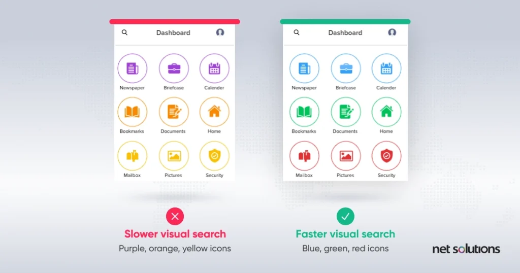
3. Decorating the Content Across the UI
A neat and clean design that is rich in information is ever-welcome! That means you need to maintain a beautiful user interface without compromising on any intrinsic data/information. Generally, there are three aspects to achieving perfection with content, i.e., relevancy, clean design, and iconography.
4. Go for Nice & Simple Charts
A noteworthy dashboard UI should be a hub of charts that act as primary data visualization trends. If you are choosing complicated charts that are tricky to decipher, you are certainly going the wrong way.
Choosing a relevant style of chart that is commonly used and accepted among your users is essential. You need to control your urge to try new ideas for representing information; in this case, the simpler, the better. The following table gives an insight into the different types of charts available and highlights the instances where you can boost your digital experience design.

Additionally, the following tips can do wonders when working on charts for user dashboard design:
- It is always recommended to choose either bar charts, pie charts, or even line charts as they are long-lasting options and are easy to understand.
- No matter how strongly you feel about it, do not invest in 3D charts or, more precisely, “skeuomorphic design.” It would be a good choice if you chose a flatter design instead.
- Always choose a chart that suits the data you wish to represent, and ensure that it gracefully accommodates the variables you showcase.
5. Take Care of the Fonts
Though it is a personal choice when choosing the fonts and their corresponding sizing, there are specific parameters to look after when building a usable dashboard UI design. It is common for designers to include different fonts for different categories of data, but it is not a good design practice. For any cleaner design, it is strictly recommended to stick to one font, which, in turn, does not exceed three chosen sizes.
However, you can always add the “Bold” effect to your text and modify its color to showcase its significance.
As for some add-on tips, you could also refer to the following:
- Serif Font could be a decent choice for the “Body” text. Also, these fonts are used in a lot of books, thus making them look a bit familiar.
- An alternative font style, “Sans-Serif,” makes for a great choice when highlighting the main and sub-heading.
- Always choose text and background colors that complement each other and look soothing to the eye. Remember, dark and dark do gel up well, and vice versa.
6. Know your audience
This couldn’t be simpler – know who will use your product. Make sure you follow a clear objective and ease your user’s journey. All information or data should be easy to comprehend for your users, and you must understand the impact of design on your audience.

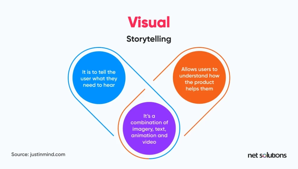
7. Storytelling is the key
Dashboard storytelling displays data in compelling visualizations that depict the narrative of key performance indicators, business strategies, and processes on a single screen in real time. Storytelling builds a coherent narrative around the people we’re designing for, allowing us to establish a deep psychological insight into their motivations and needs.
8. Add interactive design elements
A comprehensive dashboard will enable you to delve quickly into specific trends, metrics, or insights. When considering what makes a good dashboard, it is critical to incorporate drill-downs, click-to-filter, and time interval widgets into your design.
They’re cool and interactive and allow you to show or hide key insights whenever you want, rather than wading through mucky piles of digital data.
9. Be consistent with labeling data points
The primary goal of a dashboard is to gain the power to extract key insights at a glance. It is essential that the labeling and formatting of your KPIs, tools, and metrics are consistent. Using wildly different formatting or labeling for related metrics or KPIs will create confusion, slow down your data analysis operations, and increase your chances of making errors.
10. Simplicity is indispensable
A well-thought-out dashboard should be designed, but the end-user should see a simple data story with the main points highlighted, and the points should be immediately evident. If this is not followed, more questions about the dashboard will be raised rather than discussing the points you’re attempting to make and the story you’re trying to present.
11. Make it clear, intuitive, and customizable
Great dashboards are simple, interactive, and easy to use. They must communicate information at a glance using efficient data visualizations that allow users to extract actionable insights, identify trends and patterns, and identify improvement opportunities via a user-friendly online data analysis process.
Keeping these requirements in mind, the foundation for an effective dashboard design UX should prioritize the most relevant data, consider usability, and be guided by core business objectives.

12. Your intent must be clear
Be specific about your goals; the purpose of your board will guide its design. Include only what is necessary; everything should support the intent of your board.
13. Decluttering is crucial
Your goal must be to simplify data for your users. A clean and sorted mind helps us think clearly. Allow your users to comprehend the information quickly by eliminating the excess data points. This will help your users in thinking clearly and assist in decision-making.

14. Remember, it’s not for you
We’ve discussed several guidelines for creating the ideal dashboard. They are designed to be broken. Ensure that your design speaks to your audience. It must be centered around them. So, whether it’s a Twitter feed, new deals, or a daily cat gif, remember that it’s okay to break the rules now and then if it means more people will interact with your dashboard. Just don’t go overboard.

15. Keep evolving
Don’t just leave your dashboard after you’ve built it—request feedback from your team.
- What are they most interested in or find most valuable, and why?
- What are they never interested in or find the least useful, and why?
- Is there anything else that they might find helpful?
- Is there any difference in the way they work now?
Make use of this feedback to improve your dashboard. Check that your dashboard is driving the desired behavior. Take a step back from your board now and then to examine how all of the elements interact.

Remind yourself of what information you’re trying to convey and how effectively those key points stand out.
How Can Net Solutions Help Your Business?
Our experts have helped a myriad of industry leaders build potent platforms that were highly profitable for them.
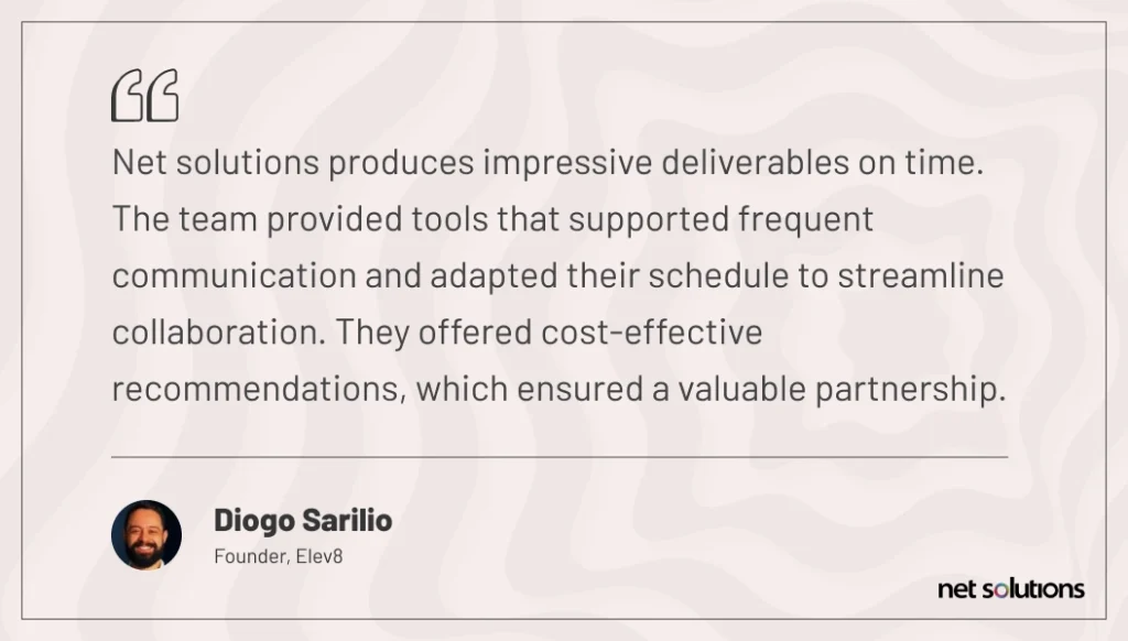
Diogo Sarilio, a Panamanian native, had an idea for a product he believed the market would respond to—if only it were available. He needed a team of design experts and technical magicians to assist his venture. His idea was to create an app to provide video-training courses, helping employees improve their soft professional skills.
Diogo spent months finalizing the wireframes, followed by a search of hundreds of companies to help him bring his vision to life. Since the idea was to build an app on a startup’s budget, it was challenging but not impossible. Due to this shift in strategy, Diogo began looking for development partners specializing in MVP development. That’s when he discovered Net Solutions, a company with a track record of developing MVPs. This enabled him to enter the market on a reasonable budget while providing a solid product that would garner attention.
The result?
Despite being launched amid a significant health crisis, Avance gained traction and recognition in the competitive world of training and development.
Avance has gained many new clients due to the app’s intuitive, gamified design, useful administrative features, and exceptional content.

Frequently Asked Questions
Great dashboards are simple, interactive, and easy to use. They must communicate information at a glance using innovative data visualizations that allow users to derive meaningful data, identify trends and patterns, and spot opportunities for improvement via a user-friendly online data analysis process.
Know: How many users are there on the site?
Examine: Analyze your users’ actions. These users do this, or that course is in demand, etc.
Evaluate: Can you demonstrate that these courses resulted in higher grades? Was your new content more successful?
What evidence supports this conclusion?
- Step 1: Planning
- Step 2: Data Discovery
- Step 3: Design
- Step 4: Implementation
5-9 visualizations
Each dashboard should only have 5-9 visual representations. However, some dashboard designers believe they must cram as many details as possible into their dashboard to provide a complete picture, which isn’t recommended.