

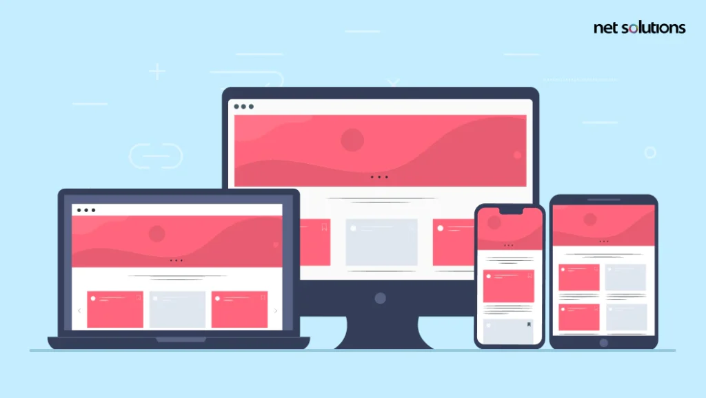
Designing a website that looks and works well requires creating a website that responds to the various screen sizes in use across various smartphones, laptops, tablets, and desktop computers (or smartwatches, tv’s and more). The fact is, people today spend up to 4.2 hours per day on their smartphones, with 54.85% of global web traffic coming from mobile devices (excluding tablets), making a strong commercial argument for the need to optimize for mobile devices.
However, a “mobile version” of a website still doesn’t capture the wide variety of smartphone and tablet screen sizes and resolutions. That’s where responsive web design comes in – the ability to create one website that adapts independently.
In this guide, learn the answer to “What is a responsive web design?”, the benefits of responsive web design with the right design collaboration, and insights on how to build a responsive website to meet the demands of 2025 – and beyond.
What is Responsive Web Design?
According to Gartner, the responsive web design definition is a “client-side technique supporting multiple layouts in a single Web instance.” But this is a complex definition for a simple concept.
In layman’s terms, responsive web design (RWD or simply “responsive design”) is an approach to web design that ensures the website looks and works well across a variety of devices and screen sizes. Responsive design is related to the graphic user interface (GUI).
A responsive web design automatically scales the content and elements, ensuring users see everything they need to see – no missing pieces or cropped images – without the need to design dedicated websites for mobile or for any of the other screen sizes today.

We respect your privacy. Your information is safe.
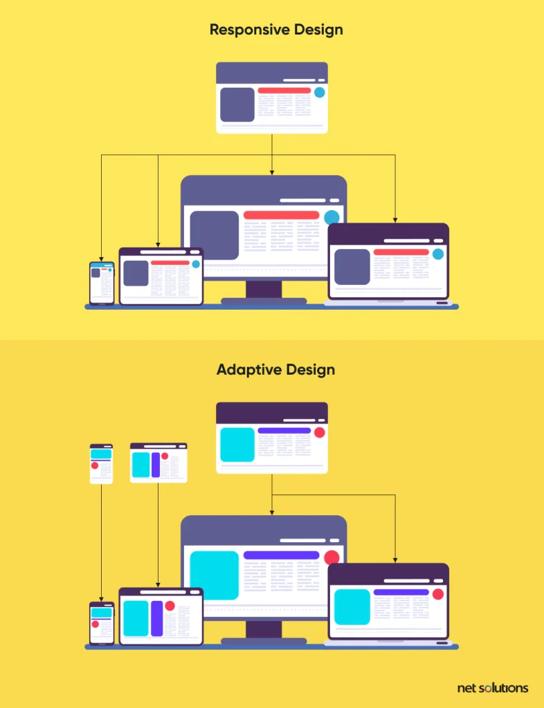
Responsive vs Adaptive Web Design
In mobile website development, there are two main approaches (or frameworks) for design: responsive and adaptive. Both result in websites that are optimized for mobile devices, with image sizes, spacing, and positioning optimized for a variety of screen sizes. This takes us to the long debate over – customer experience vs. user experience. But before understanding the intricacies, let’s review how responsive and adaptive design helps your approach.
In responsive design, design elements are developed to scale across a variety of device sizes. A responsive web design is just one version of the website that adjusts automatically based on the user’s screen size. As a single design, responsive web design is faster and cheaper, but a single mistake in image sizing or padding can impact user experience when adapting to smaller devices.
In adaptive design, the website design is purpose built for each device class. In adaptive design, the server determines which version of the website is served to each type of device. This is a more costly approach in the short and long-term, but it is optimized for user experience on each specific device.
What are the 3 Components of Responsive Web Design?
When people ask “How do I make my website responsive?”, the answer lies in including the following three components that help the design “respond” to various devices with the optimized viewing experience:
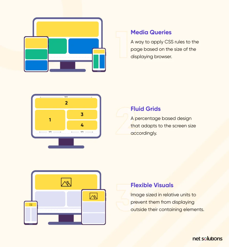
1. Media Queries
Media queries are filters applied to CSS that respond to the type of device, screen type, displaying browser or even device orientation. The purpose of a media query is to allow for different layouts using the same content blocks, each one optimized for the size or features of the device in question. A media query will design follow a rule based on minimum and/or maximum width parameters, alongside other factors such as resolution, browser, and orientation.
2. Fluid Grids
A responsive web design uses an algorithm to normalize the UI elements to the size of the screen and the pixels. It does this with what is known as a “liquid layout” that considers each component by the percentage it takes up in the width – a content block, image, and the padding between and around blocks all add together to make up 100% in the width.
3. Flexible Visuals
Images should be created in relative units called “effective pixels” (epx) to express layout dimensions and spacing, something that is more akin to “perceived size.” Elements should be designed with a base unit of 4 epx to ensure the design always scales to a whole number when the fluid grid is applied.
7 Key Reasons Why Responsive Design is Important for Business
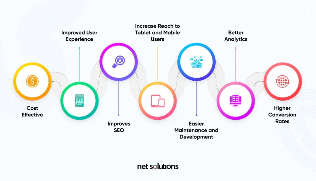
1. Cost Effective
Instead of designing websites for different screen sizes, a responsive web design can be created just once. Aside from the up-front cost savings, this also has long-term cost savings each time there’s an update, an A/B test, or new screen sizes emerge.
2. Improves User Experience
Users today expect a consistent, fluid experience across channels. In retail, for example, a buyer may begin their journey on mobile and continue on a desktop or laptop device. A responsive web design offers users a consistent experience at every touch point. Further, responsive web design ensures the design always looks the best – no pinching, zooming, or unnecessary scrolling to navigate around.
“Creating a great online customer experience starts with getting the basics right.“ – Jochen Heck & Gopi Kallayil, Google
3. Improves SEO
Responsive web design both improves SEO (search engine optimization) and also eliminates the SEO risks associated with separate mobile websites:
a. No Duplicate Content Penalty
With a mobile website version, businesses risked duplicate content penalties. Google’s bots cannot tell which version of the site should be indexed or tracked for link metrics. Just one version of the website reduces this risk and allows web teams to focus all SEO efforts on only a single site.
b. Loads the Website Faster
Google uses over 200 ranking factors in its algorithm, including whether a site is responsive (as a measure of how user-friendly it is) and its speed. Responsive sites typically load faster than mobile-targeted designs. Concepts such as “performance budgets,” including compression and adaptive images, can be applied to further improve responsive web designs.
4. Increase Reach to Tablet and Mobile Users
When a website is designed to be responsive to mobile users, this translates into more sticky customer experiences. 74% of people who visit a mobile-friendly site are more likely to return to that site; 67% are more likely to make a purchase. Conversely, 61% of users who don’t find what they are looking for on a mobile site are more likely to move on to the competition – and never return.
5. Easier Maintenance and Development
As noted, developing a single website version will always be faster than developing multiple versions of the same website, even with the added task of ensuring the 3 components of responsive web design are implemented correctly. This is true for both development and marketing teams, whose job is to ensure that each version of a website looks and works effectively and contains the latest content and updates.
The choice to develop a responsive website simplifies maintenance, updates and improvements over time. Without duplicating maintenance and marketing tasks, organizations have more time for value generating activities such as product development, A/B testing, or content marketing.
Lastly, the choice to use responsive web design helps future-proof the website against new screen size options that may emerge as technologies shift.
6. Better Analytics
Insight is always more effective if you can track the consumer journey across all touch points. With adaptive web design, IT and marketers are tracking and collating data to two different web properties, making insights more difficult to track. With a single responsive web, it’s easier to set up analytics and to get meaningful insight.
7. Higher Conversion Rates
64% of online retail traffic comes from mobile, yet mobile conversion rates are half of desktop rates. There are many factors that influence mobile conversion rates, including difficult navigation (19.3%), cannot see product detail (19.6%), difficult browsing (19.6%) and difficulty inputting details (18.6%). To put it simply, many websites fail to convert because they are not responsive. Conversely, one study indicates that responsive web design can lead to a 10.9% increase in visitor to buyer conversion rates year-over-year.
8 Effective Tips on How to Make a Website Responsive
In deciding on an responsive web design project, ensure success by following these best practices to ensure that all design elements remain flexible, whether image, text, padding, or layout. Best practices suggest:
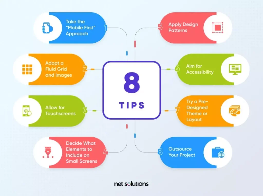
1. Take the “mobile first” approach
Mobile websites have the greatest UX challenges, so designing for mobile and scaling “up” generates the best results. Design for perceived size, knowing users prefer larger designs on smaller screens to avoid pinching and zooming. Ensure designs are intuitive at every layout and size – particularly the smallest mobile size.
2. Adopt a fluid grid and images
Create images with a base of 4 px to ensure they scale to any percentage necessary in the fluid grid format. Test across common breakpoints for desktop displays, laptop displays, mobile displays (various), tablet displays, or other displays that could be relevant for your audience (e.g. tv or smartwatch).
3. Allow for touchscreens
User interface differs depending on the method of interaction: mouse and keyboard vs touchscreen. Touchable elements should be large enough on small screens to be usable, with simple navigation, responsive buttons and links, adequate swipe space, touch gestures, and optimization for the thumb zone.
4. Decide what elements to include on small screens
Designers use responsive breakpoints to decide what does or does not happen in each layout style. Decide on what is functionally and visually necessary on the smallest screen to help support.
5. Apply design patterns
Responsive web design patterns fall into five categories as defined by Luke Wroblewski: mostly fluid, column drop, layout shifter, tiny tweaks, and off-canvas. These patterns help define when columns or blocks adjust from multi-column to single-column, the order of the elements as these shifts occur, or whether elements become “hidden” in off-screen options until exposed by a user.
6. Aim for accessibility
An accessible web design applies the 4 principles of web accessibility: perceivable, operable, robust, and understandable. Mobile accessibility should include adequate contrast (ratio 4.5:1 for normal text or 3:1 for large text), active elements should be focusable, design for large perceived text size, with accessibility features to support machine reading, voice to text input fields, alternate navigation, and features that do not rely on color contrast to indicate function.
7. Try a pre-designed theme or layout
Pre-designed themes and layouts can be a huge asset in creating or converting a website to be responsive. To work with a theme, you would make changes to colors, images, or content within the guidelines of the framework to ensure the updates remain responsive. Many popular web platforms such as WordPress offer responsive themes.
8. Outsource your project
To accelerate your time to market with a custom responsive website, consider hiring out to a team that has experience designing responsive web sites that tick all the above boxes. Look for an outsource partner who can help advise on the entire process, from technology stack and hosting to design to development and integration of microservices. Be sure to involve only those organizations with clear processes on each stage of the project and who don’t leave testing for the end!
Responsive Web Design Examples
The first website to feature a responsive web design was Audi.com in 2001. Since then, more and more organizations are shifting to responsive web designs, including:
1. Shopify
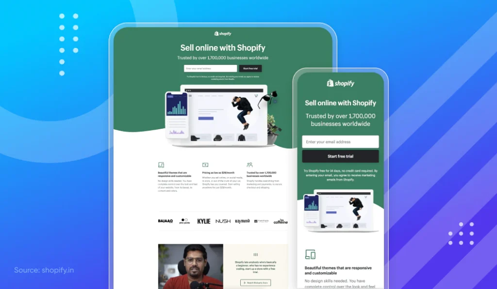
Digital experience design is essential to Shopify’s ecommerce platform designed to be responsive, with many responsive themes for users to create their own responsive ecommerce websites. This is important, as well over 80% of all traffic and 71% of orders on Shopify stores come through mobile devices.
Shopify adapts its design by carefully selecting images that crop (instead of zoom), with content that streamlines to a single-column without some of the “extra” elements. Navigation adjusts as well, with mobile and tablet websites featuring the hamburger menu.
2. YouTube
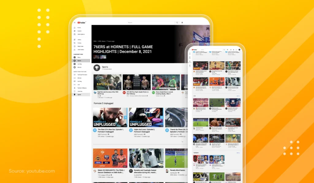
YouTube has over 2+ billion users, with over 70% of users coming from mobile. YouTube is available on the web or as a responsive progressive web app (PWA), adjusting its familiar grid format into smaller grids (fewer columns) before adjusting to single video browsing on the smallest of screens.
3. Google Maps

It should come as no surprise that Google Maps is predominately used on mobile devices and is currently the most popular navigation app.
Conclusion
Designing for mobile devices is more than essential to success in today’s marketplace for businesses of all sizes. If your website is not already mobile, or you have realized the high cost of maintaining a mobile site that still isn’t flexible to a wide enough variety of device and screen types, it could be time to look at responsive web design.
At Net Solutions, Our skilled team of UX and UI designers produces fluid, intuitive and eye-catching designs for websites. Because a good website is not just responsive, it has that “X-factor” of irresistible design and user experience. Want to learn more about user experience design services?