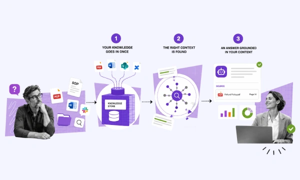
facebook Is Skeuomorphic Design Dead or Alive? Net Solutions

Is Skeuomorphic Design Dead?

Skeuomorphic design means that the design of the object imitates its real-world counterpart. The UX design type tries to blur the thin line between the digital and the real world by introducing objects that users can relate to.

Like when you see shapes in the cloud, it is known as pareidolia. In a similar fashion, when shapes of digital objects look like real-world objects, it is called a skeuomorphism that can be referred to as human-centered design.

An ideal skeuomorphic design example can be a digital-analog clock. The digital clock on your phone or desktop not only has a similar design as that of a physical one, but its reflections, shadows, and raised needles — make it look exactly like a real one.

However, the skeuomorphic design is losing its popularity as simplistic design patterns such as flat design and neumorphism are gaining traction.

Here’s everything about skeuomorphic interface design and the new design methods that are gaining traction.

What Does Skeuomorphic Mean?

If a graphical user interface design follows skeuomorphism, it means that the design imitates a widely accepted real-life object. The idea is about simulating a user experience that people can feel relatable to.

Skeuomorphic design directly relates to “perceived affordance,” i.e., an object’s shape or structure that suggests its usage.

When affordances are taken advantage of, the user knows what to do just by looking: no picture, label, or instruction is needed. — Don Norman, Grand Old Man of User Experience

In short, a skeuomorphic object tries to induce an intuitive behavior and sidelining the surprise factor.

There are three perceptions of a skeuomorphic design, which include:

1. Visibility

How does the object look?

If the virtual-world object looks similar to a real-word object in terms of shape, size, texture — it has visibility-empowered skeuomorphic design elements. As the real-world perception of the object changes, the digital version’s design evolves too.

For instance, an analog clock on the phone or the desktop looks similar to the real-world clock with respect to texture, depth, dimension, height, width, and overall outlook.

2. Overall Structure and Shape

What perception does the overall appearance give?

The overall structure and shape imitate the real-world object, i.e., the clock looks like a clock w.r.t. Shape and overall structuring. If you look at it, you’ll instantly know that it is a clock that shows you time.

3. Functionality

How does the object behave?

If the virtual-world object imitates a real-world object’s behavior, i.e., the functionality is the same in both cases — it has functionality-empowered skeuomorphic icons.

Fun Fact: Even if the visibility-driven skeuomorphic design gets replaced by a flat design or a neumorphic design, the functionality-driven skeuomorphic design will be constant — designing for relatability a sense of familiarity is evergreen.

That means that skeuomorphic design is going nowhere. The misconception behind the UX design trend losing its base grew when tech giants such as Apple and Microsoft replaced skeuomorphism with flat design. But, the reason why Apple move away from skeuomorphic design is that they wanted to improvise and innovate — something the brand is known for.

Skeuomorphic Design vs Flat Design vs Neumorphic Design

Flat design is more prevalent today, which has taken over the skeuomorphic, 3-D type design. The flat design is synonymous with minimalism, cleanliness, and sophistication. This is why flat design is favored over skeuomorphic design now.

The flat design does not support depth, shadows, and texture. Here’s a visual example.

example of flat design

Another interaction design trend that has been making rounds in the market is — neumorphic design. This new design method is a blended form of skeuomorphic and flat design. Since its inception, the comparison between skeuomorphism vs neumorphism is going viral.

In this new design, the objects are not placed above the background but behind it. Whenever a selection is made, or an object is touched, it protrudes out of the screen. Neumorphic design uses toned-down contrast and solid colors, and the background is of the same color as that of the object or the object outline.

Example of neumorphic design

Is Skeuomorphism Design Going to Stay Around?

The death of skeuomorphism is a hoax, and the design trend is here to stay. No matter what design trend dominates the market, the structure, the shape, and the behavioral quotient of skeuomorphism (similar functionality as that of its real-world counterpart) will showcase consistency.

No matter what design type you choose, ensure that all the essential elements of user experience design are in place. Here’s a conclusive example that will help you differentiate the three more aptly.

  • Skeuomorphism: Objects that mimic their real-world counterparts both in appearance and behavior.
  • Flat Design: This is the minimalistic design trend that eliminates shadows, depth, and textures from the objects.
  • Neumorphism: This is a design trend where the objects are placed behind the background and have the same borderline or overall color as that of its background.

Skeuomorphic design vs flat design vs neumorphic design - example

This will make the picture clearer as the three designs have a different elemental appearance, yet the overall structure and functioning mimic the real-world object, making it skeuomorphic.

Conclusion

The skeuomorphic design never lost its relevance; instead, it is the root of other design forms emerging with changing times. The overall structure and the behavior of the objects continue to mimic their real-world counterpart — the appearance, however, can change from time to time.

The advent of flat design and neumorphic design gives a perception that skeuomorphism is fading away. But, in reality, the three design trends are more intermingled than what meets the eye. In this writeup, we tried to explain the relevance of all the three designs and why skeuomorphism isn’t dead.

When choosing among the design trends for your website or products, follow this thumb-rule:

Keep track of the trending UX designs, choose the one that suits your product or website type, and consistently follow it. Most importantly, design for your target audience, and consider their perceptions, psychology, preferences, likes, and dislikes when moving ahead.

Request Free Consultation

Talk to our experts for help with designing meaningful designs that attract likeability and conversions


Ravneet Singh

About the Author

Ravneet Singh, with over 19 years of experience, stands out as a dynamic Design Manager. He excels in fostering a collaborative and innovative work environment, emphasizing teamwork and creativity to deliver top-notch, user-centered design solutions.


When not working, Ravneet indulges in various activities to maintain a balanced lifestyle. He enjoys watching movies, listening to music, and engaging in hobbies outside of his professional realm. His passion for travel and good food get him to interact with people of different cultural activities, make new connections, and explore different cuisines.


A career highlight for Ravneet was the successful, ahead-of-schedule delivery of the American Golf e-commerce project.


Above all, Ravneet values family, respect, and integrity, principles that guide his personal and professional life.

Pin It on Pinterest