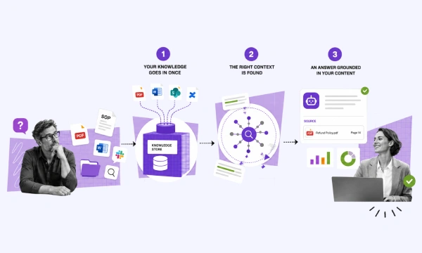
facebook 97 Point Mobile-Friendly Web Design Checklist | Net Solutions

97 Point Mobile-Friendly Web Design Checklist

Mobile accounts for over 55% of global web traffic, yet most websites continue to be developed for the desktop experience – at great cost. 53% of smartphone visitors will leave a website if it doesn’t load within the first 3 seconds and 70% of mobile shoppers abandon their purchase if the process is too difficult or frustrating.

On the flip side, investing in a superior mobile experience will pay dividends in the form of higher page views, greater conversion, higher SEO rankings, and increased customer loyalty. Research has found that mobile designs that prioritize user experience (UX) can lead to a 30% increase in sales.

This guide will walk you through the must-have elements for mobile-friendly websites and powerful add-ons that can help take a mobile website to the next level – delivering a more powerful user experience. Mobile app development solutions are only successful when they meet users’ needs. Read further to gain a better perspective on mobile-friendly web designs.

Optimize mobile user experience to increase sales and loyalty. Tweet This

What is Mobile-friendly Website Design?

what is mobile-friendly website design

A mobile-friendly website is a site design that is optimized for smartphones and tablets; a site design that is not just scaled down, but rather is purpose-built for the mobile experience. A mobile-friendly website design will take into consideration performance across a variety of bandwidth scenarios, as well as a design that can be easily viewed and navigated across a variety of screen sizes.

Mobile Friendly Web Design Checklist


We respect your privacy. Your information is safe.

Is My Website Mobile-Friendly?

Before looking at the checklist, the first step is to take stock of the existing performance of the mobile platform. Chances are that most mobile websites may fall short in some areas or may perform slower than optimal. Mobile app development doesn’t add much value if the design doesn’t appeal to your users. To get a baseline on website mobile experience, there are some great online tools to assess mobile performance:

Mobile-Friendly Web Design Frameworks

In mobile website development, there are two main approaches (or frameworks) for design: responsive and adaptive. In responsive design, the website design is developed to scale across a variety of device sizes. In adaptive design, the website design is purpose built for each device class. Responsive designs typically load faster, boosting their SEO, and are more sustainable in the long-term from a maintenance perspective.

mobile-friendly web design frameworks

Mobile-Friendly Web Design Checklist

Page Layout Considerations

Page layout needs to be both visually appealing as well as organized to support mobile browsing. For example, 49% of people use their phone single handed, so navigation items need to be within a natural finger swipe. The start of this checklist examines best practices for page layout:

ease and difficulty of thumb touch on a mobile screen

1. Keep important elements within reach

2. Place your logo in the top left

3. If eCommerce, place the shopping cart in the top right

4. Place the search in the top right

5. Keep the number of menu or navigation items to a bare minimum

Design

A standard website design may not directly translate to a smaller screen – it may appear too ‘busy’ and involve icons that are difficult to see. In designing for mobile, the process must incorporate user feedback to help you arrive at a good UX design.

mobile-friendly web design - good ux design

6. Keep it simple. Simple sites are more aesthetically pleasing, easy to navigate, and reduce the number of steps to do something (find, read, purchase)

7. Include white space and negative space to create a feeling of clean design and to minimize code bloat that impacts performance

8. Choose a common font in a large enough size to avoid pinching or zooming

9. Ensure any playable content (video) does not auto play and is supported across all target devices

10. Minimize the number of images to prioritize performance

11. Be consistent in color choices that reflect your brand

12. Ensure elements of the design are of an appropriate size (scale)

13. Follow labeling best practices to create a sense of familiarity

14. Consider accessibility elements like color, contrast, font, focus indicators, labeling, and tags for screen readers while laying out the UX design.

15. Ensure all “like” pages look the same

16. Hide detailed information with a “+” or with sub-menus

*Powerful Add-Ons*

17. Integrate social proof (user reviews, photos, social media)

Navigation

mobile-friendly web design - navigation

Mobile navigation is often the most important element of user experience design. So, the kinds of menus, how they work, and where they are placed are of great importance. Easy is the goal.

18. Prioritize a hamburger menu (three stacked lines) for site navigation instead of the traditional navbar, which takes up too much valuable real estate

19. Focus on ease of navigation with a minimum number of clicks needed to find what users want

20. Include a fixed navigation bar in the bottom with a maximum of 5 items on the bar. Use icons or a combination of icons and text.

21. Use icons to represent common functions and categories of your website

22. Highlight the current in-use navigation position with a line or color shift

23. If your site supports a user profile, include the standard profile icon (person) in the top navigation

24. Make it clear how to open and close any pop-over items or menus

25. Make it clear how to return to the previous page

26. Hide elements that do not add to the main experience (profile, help, settings)

*Powerful Add-Ons*

27. If eCommerce, ensure that returning to the previous page preserves the position on the page

28. Integrate mobile chatbots to offer personalization, improve search, improve engagement, or improve customer service

Buttons

The goal for a button is to make the desired action obvious – by ensuring a clear path and call to action. The more buttons there are, or the difficulty in finding the buttons, the greater the chance people will be lost along the way.

mobile-friendly web design - buttons

29. Ensure buttons and menu items are large enough to click without being missed

30. Ensure high contrast and white space to improve action clarity

31. Provide action feedback (animation, change-state, sound, haptic)

32. Make the priority button the most obvious

Search

33. Use the standard magnifying glass icon for search

34. Open a search box with placeholder “Search” or prompt text (“Search for products”) as a hint

35. Place search in the top right of the screen

36. Make search a fixed element on all pages

37. Make the search easy to clear / reset

38. Correct or fix misspellings

39. Show the search history

40. Display the number of results found

41. Ensure you have a no-results page that prompts further action (alternate search, category icons, etc)

42. If site search is your main focus, include it prominently on the homepage

43. Reduce the default number of search results for fast loading

44. Support multiple views for search results (boxed, product detail, number of results)

45. Allow filtering of search results and make it easy to see / clear filters

*Powerful Add-Ons*

46. Include search auto-complete to speed up search

47. Include suggested search items based on trending or sponsored content

48. Include the option to browse by category categories

49. Leverage AI to offer personalized experiences.

50. Support voice search

Performance

Speed is important for user experience – as well as search rankings. 53% of visits are abandoned if a mobile site takes longer than three seconds to load, with the top 10 search results often loading between 1 to 2 seconds. Google’s rule of thumb is to design for a “page weight” of no more than 1000 KB.

performance quote

51. Minimize image sizes / include image compression (by 30-40%) to optimize performance. Ensure you are scaling your images, not the browser.

52. Ensure your website server can provide the speed you need

53. Enable browser caching

54. Minimize HTTP requests

55. Leverage CSS to add elements such as shadows, rounded corners

56. Put scripts at the bottom of the page, or remove them, to allow the page to load faster

57. Load above the fold first (“lazy loading”) to improve user experience

58. Minify / minimize your code (HTML, CSS, JavaScript) by removing unnecessary elements, spaces, comments, scripts, or files.

If you don’t have a fast website, people will bounce faster than you can say ‘conversions.’ – Niel Patel

E-Commerce (Shopping Cart)

59. Support sign-up and login by social media account or by Sign in with Apple

60. Keep form fields to the absolute minimum as it’s one of the best form design practices.

61. Allow one-click guest checkout

62. Allow users to turn on / off password preview controls

63. Support digital payments such as digital / mobile wallets (Apple Pay, Google Wallet, etc), PayPal or Alipay, in addition to debit or credit card purchases.

64. Support saving address, card details or payment preferences

65. Support scanning of credit card details

66. Support toggle for country / currency
>
67. Show all products, sizes, prices in the cart

68. Allow for full price on the cart screen (including shipping, applying promo code)

69. Integrate a pop-over cart summary

70. Show the number of items added to the cart

71. Provide feedback (message, haptic) when an item is added to a car

72. Offer a variety of shipping speed (cost) options

73. Be transparent about where you ship

*Powerful Add-Ons*

74. Support shipping preview without sign-in or sign-up

75. Offer the option to buy-online, pick up in-store (BOPIS), clearly articulating if pick-up is curbside

76. Integrate with points programs to support shopping with rewards

77. Consider “buy now, pay later” systems to split payments into installments, which has been proven to boost sales

78. Offer green shipping options (reduced packaging, send in as few shipments as possible) to support sustainability and “green” initiatives

Forms

The fastest way to lose customers is to ask too much of them too quickly.

top reasons for abandonments during checkout

79. Keep fields to a minimum (e.g. one field for name, vs two)

80. Reduce visual clutter with progressive forms or single column layouts

81. Use text placeholders to improve clarity of each field

82. Provide the appropriate keyboard for the field (numeric vs text)

83. Integrate autocorrect

84. Use autocomplete

85. Ensure errors are clear. Ideally jump to the problem spot

86. Make the call to action (data submission) clear at all times

*Powerful Add-Ons*

87. Leverage mobile integrations to support saved identifies

88. Automatically scroll down the screen after completion or place completed items out of sight

89. Include a progress indicator for completion of eCommerce steps

Security

90. Use HTTPS and its “lock” symbol

91. Choose a secure web host

92. Where appropriate, state that information (address, credit card) will be kept confidential

93. Ensure your privacy policy is visible on all page footers

94. Display logos of trusted payment providers

95. Make it obvious how to contact you for help

*Powerful Add-Ons*

96. For eCommerce, support 2-factor or multi-factor authentication

97. Consider secure socket layers

How Net Solutions Can Help

At Net Solutions, we focus on mobile UX design. Our experienced team of mobile web designers and developers have put together this checklist with tips to help you optimize your mobile web design.

97 Point Checklist for Mobile Friendly Web Design


We respect your privacy. Your information is safe.

If you want a hand up on your mobile website, eCommerce platform, or mApp, contact us.

Request Free Consultation

Hire experts to build your mobile website, eCommerce platform, or mApp.


Ravneet Singh

About the Author

Ravneet Singh, with over 19 years of experience, stands out as a dynamic Design Manager. He excels in fostering a collaborative and innovative work environment, emphasizing teamwork and creativity to deliver top-notch, user-centered design solutions.


When not working, Ravneet indulges in various activities to maintain a balanced lifestyle. He enjoys watching movies, listening to music, and engaging in hobbies outside of his professional realm. His passion for travel and good food get him to interact with people of different cultural activities, make new connections, and explore different cuisines.


A career highlight for Ravneet was the successful, ahead-of-schedule delivery of the American Golf e-commerce project.


Above all, Ravneet values family, respect, and integrity, principles that guide his personal and professional life.

Pin It on Pinterest