
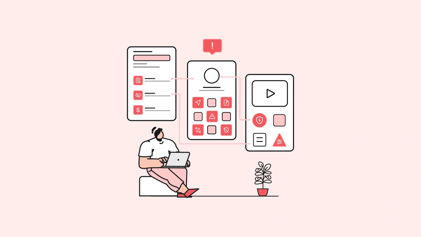
Dark patterns in user experience design are tricks used to manipulate and redirect a user to perform a forced action, which they do not intend to perform. A typical example of a dark pattern is the gated content that does not allow you to access a website as sign-up is the only option if you wish to continue.
Dark pattern designs have been quite prevalent in the digital space as businesses think it to be an easy way to increase traffic and thus conversions. But, contrarily, it does not turn out as expected because the target audience is more aware and does not fall for such gimmicks.
Most business models have focused on self-interest instead of user experience. – Tim Cook, Apple
While businesses feel they can increase their subscribers by doing so, the user experience gets hurt badly. This is the reason why the dark patterns are also known as “manipulative design.”
Here’s everything you need to know about dark patterns UX and how to avoid them.
Dark Pattern: Definition
A dark pattern is a term introduced by Harry Brignull, a London based UX designer. He defines these patterns as:
A dark pattern is a type of user interface that appears to have been carefully crafted to trick users into doing things that are not in their interest and is usually at their expense.
Thus, we can say that the dark patterns are manipulative and mandatory design choices that businesses make to force a user into performing an action that suits their interest. The customer needs, and viewpoint is completely sidetracked, which makes it an overall bad practice.
As per a recent report by Business Insider,
California is banning companies from using ‘dark patterns,’ a sneaky website design that makes things like canceling a subscription frustratingly difficult.
It is similar to playing with a user’s psychology out of self-interest and is not considered ethical in any way.
We respect your privacy. Your information is safe.
What are Some Common Types of Dark Patterns?
There are many types of dark patterns. The common ones include:
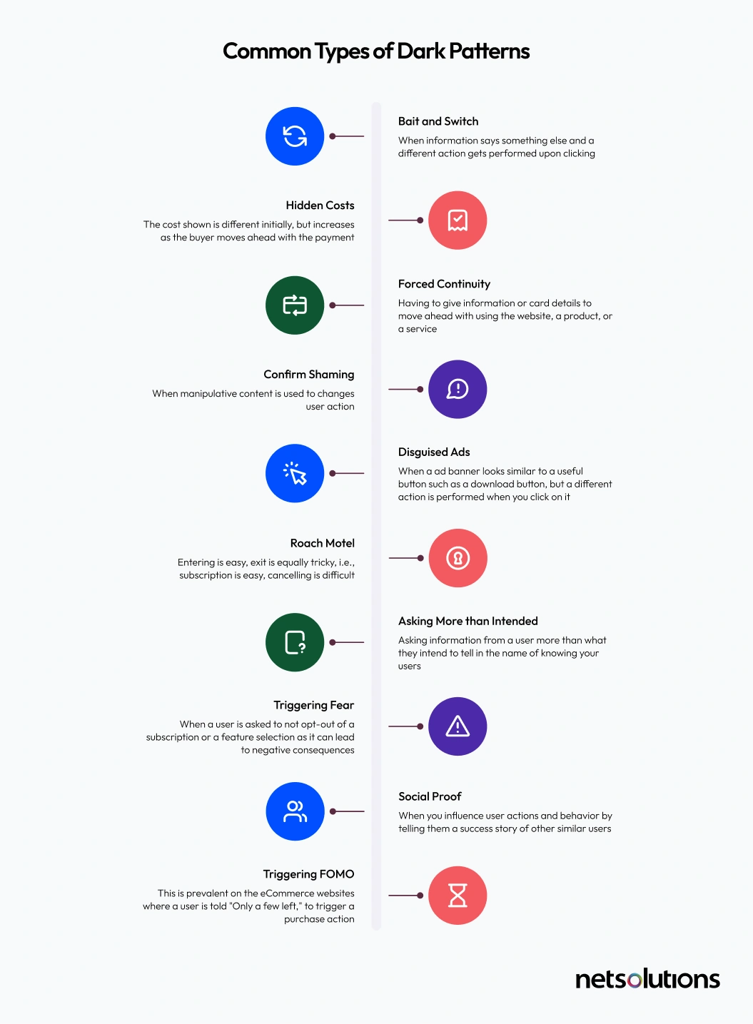
1. Bait and Switch
When fake data or information is put forward, that talks of a user’s interest and when the user shows interest. When the user shows interest and moves ahead by clicking— the information or data changes altogether. Bait and switch is a trick that businesses generally use to get more clicks. One bait and switch dark UX example is the Windows 10 dialog box, where clicking X results is initializing the upgrade.

2. Hidden Costs
When a specific price is displayed for a product or a service, and the price shockingly increases (taxes and delivery fees) once the user moves ahead with the checkout.

3. Forced Continuity
When you have to start your free trial by adding your card details, or you need to enter your email to continue using a website or an app. Choosing to skip these self-interest gimmicks is not an option in forced continuity.
4. Confirmshaming
When your pop-up copies try to manipulate a user and play with a user’s mind — confirmshaming is the result. For example:

5. Disguised Ads
A disguised ad is a dark pattern where an advertisement banner on the website or the app looks similar to useful content that the user is looking for and falsely clicks on to realize later that they have been spammed.
Forty percent of users click on an ad because it seems interesting, while a whopping 34 percent click on an ad by mistake, often tricked into clicking them. — Hubspot
The biggest dark pattern examples of such a false practice was followed by Softpedia, where ads looked similar to call-to-action buttons for downloading the software. It was common to click on such wrongful buttons, thus giving users a reason to flap away.

6. Roach Motel
Your entrance is an easy one-two step process, making it look worth it. However, the exit is painstaking and impossible. For example, subscribing is easy, but when it comes to canceling the subscription — the option is neither findable nor discoverable.
7. Asking More than Intended
Asking for personal information from a user more than they intend to tell is the biggest mistake that costs losing customer trust. This dark UX pattern that has existed online in the name of “knowing your users.”
8. Triggering Fear
In these types of dark design patterns, a user is suggested not to opt-out of a subscription or a feature selection as it can lead to negative consequences. For instance, Facebook relies on “intrusive default settings” and “misleading wordings.”
One dark pattern UX example of how Facebook uses dark patterns UX is that it warns users not to disable the “facial recognition” feature as it can lead to another user impersonating you.
9. Social Proof
When you influence user actions and behavior by telling them a success story of other similar users (paid or in-house members) who acted on the same lines. Brands are often seen promoting such content on websites and social media to garner more visitors and increase purchases.
10. Triggering FOMO (Fear of Missing Out)
This is more prevalent on the eCommerce websites where a user is told “Only a few left” to trigger a purchase action. This is done by almost every eCommerce business today to increase order volumes.
Reasons to Avoid Dark Patterns
While the idea of using dark UX patterns might seem irresistible, you will eventually lose customer’s trust and loyalty down the line. It is a complete no-no practice if you wish to climb the ladder of success based on how well you served customer expectations.
Here are some negative consequences of using dark patterns in design:
1. Ruins Customer Experience
As per a survey by HubSpot,
80% of respondents said they’d stopped doing business with a company because of a poor customer experience. If your customers are dissatisfied, they can — and will — switch to another provider.
Gone are the times when users were naïve and unaware of the internet and its user manipulating tactics. With changing times, users are like grown-up adults who understand everything and silently walk away when something seems to deceive.
According to research, 79 percent of users will go for another website if they do not like the content on a particular website.
Being straightforward and honest is the key to success, which, sometimes, even big brands overlook.
For instance, Microsoft prompted users to upgrade their Windows OS to Windows 10 when the new version got launched.
The tech giant broke the commonality norm by automatically initializing the upgrade even when the user clicked on the cross (X) button on the pop-up window’s rightmost corner.
This forceful up-gradation became a reason for extended backlashes from the online community.
Thus, it is essential to understand that no business can enjoy customer loyalty if you have one dish on the menu, and you serve a completely different one.
2. Increased Abandonments
Sometimes, businesses rely on UX design practices that they think will crowd their sales funnel. But, users today are more aware than before. They prefer simple and straightforward content. As a result, they prefer straightforward content.
If your brand gives them what they want without any tricks and gimmicks, you’ll be eventually increasing your reach, and even word-of-mouth marketing will come into play.
On the other hand, if the UX dark patterns are prevalent at any point, abandonments will be inevitable. Even big players like Facebook and LinkedIn have been criticized for the dark patterns they follow.
3. Loyalty and Trust Will Take a Back Seat
If your brand keeps following the tricks and gimmicks that do not talk of the user’s interests — loyalty and trust will go amiss. Even your first customers will choose a competitor over you if you continue with these uncalled-for practices.
The irony is that brands rely on dark patterns to increase the number of visitors, which, in turn, expands their databases. But, unfortunately, they ignore the fact that they’ll instead prefer moving away the moment the users detect dark patterns.
Here’s an example of how Amazon is using dark patterns to make its Prime customers stay. However, the prevalence of bad UX design practices is making users leave anyway.
I hope @amazon is on this list. Cancelled my membership today and had to click through like 5 screens. All the goodness of confirm shaming, FOMO, misdirection ?
You do know I’m still going to cancel if I want to, right? ?Reddit
— Deborah Digges (@DeborahDigges12) August 5, 2020
4. Dark Patterns are Illegal
As per a recent report, in California, businesses that continue to use dark patterns will receive a 30-day window to change their website design or risk further punishment. If a company doesn’t comply, the law states it will be “liable for a civil penalty under laws relating to unfair competition in an action to be brought by the Attorney General.”
If your business introduces dark patterns in UX, you could land in a problem and might get penalized.
Congressional leaders in the US disclosed an all-new law to ban the usage of “Dark patterns” by online businesses.
This is one law that stands valid for online businesses with over 100 million users. Warner’s Deceptive Experiences To Online Users Reduction (DETOUR) Act make it an illegal practice to design interfaces that try to:
“Obscuring, subverting, or impairing user autonomy, decision-making, or choice to obtain consent or user data.”
It might look unimportant for small businesses, but if you avoid dark patterns starting from day one, it will prove beneficial in the long run.
5. Hurts Brand Image
Darkpatterns.org is a website that supports a separate section called “Hall of Shame,” where they list the dark pattern activities by several brands in the form of tweets.
To see your brand listed there should undoubtedly be the last thing that you want. In case you experiment with dark patterns to drive conversions, and your name pops up on Hall of Shame, your brand image will be destroyed big time.
How Do You Avoid Dark Patterns in UX?
Dark patterns UX is designed to fool people and mislead them, which leads the visitors to get confused, betrayed, and frustrated. So, as a business owner, it is crucial to avoid these dark design patterns and deliver an appealing user journey.
Here are some design recommendations that need to be taken seriously to help avoid dark patterns:
- Introduce stringent design practice standards for designers
- Infuse empathy into design and favor user interest
- Prefer user experience over the number of visitors and subscriptions
- Take inspiration from web and mobile UX designs that follow an ethical design process
- Conduct extensive user research to find out user expectations
Transparency is the Key!
The only way to avoid dark pattern UX and ensure a reliable user experience is to be transparent throughout the user journey. For ensuring transparency on your business website, the website needs to do what it says it’ll do simply. CTAs, forms, and other buttons on your site must align with the action shown and the actual action that will be performed in real-time.
Ensure that the visitors on your site never feel lost or feel that the information is being hidden or manipulated. Users must be allowed to easily reverse any action like unsubscribing from a newsletter, and so on. All the elements on your website must be clear to the users and have user-friendly navigation.
FAQs
The dark mode is the ability to design with a dark palette. Rather than using white or light-colored backgrounds, black or dark background patterns are used. Presently, numerous operating systems support dark mode UX design and transfer theme and environmental information to mobile applications.
Dark UX patterns are deceptive UI/UX interactions that mislead or trick the users into performing specific actions they don’t intend to take.
Bait and switch, disguised ads, forced continuity, hidden costs, friend spam, price comparison prevention, and misdirection are the common dark UX examples.
There are numerous problems of dark patterns in UX design, such as ruining the customer experience, affecting the brand image, hampering customer loyalty and trust, and increased abandonments.
The term dark patterns is an unsustainable practice that directly impacts the UI/UX and is designed to trick the users into taking certain actions unwillingly.
Conclusion
Dark patterns might increase leads and conversions, but it does not help enhance the user experience or promote informed-decision making — the ultimate (should be) motive of businesses.
In this writeup, we explored what dark patterns are, different types of dark patterns, reasons to avoid them, and how not to follow these bad UX practices. In all, if you want your digital brand to be the north star of the industry, offering the best of user experience is the key.
The moment you start doing things out of self-interest, people will start calling you out, while you’ll lose out on customers.
Say no to the dark (patterns) side of UX design! Say yes to meaningful interactions that let the users do so as they please without any roadblocks on the way.