
From highly personalized shopping experiences to 5-minute deliveries – eCommerce has evolved beyond measure. If we look at the stats closely, the average daily time spent on a phone has recently climbed. By 2024, this time is predicted to be approximately 4 hours and 39 minutes!
But what does it mean for you? A chance to establish a brand identity for your eCommerce business.
There has been ample research on what makes some eCommerce brands outshine others.
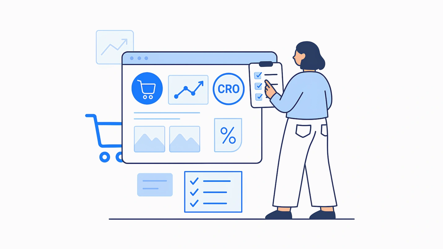
Based on eCommerce Conversion Rate Optimization (CRO) insights from experts and the 20+ years we’ve spent building eCommerce websites. We’ve assembled an eCommerce Website Optimization and CRO Checklist. You might not always use all these techniques, but each is worth considering.
We respect your privacy. Your information is safe.
Benefits of conducting an eCommerce audit
Even though eCommerce can be highly lucrative, success (as in all retail sales) depends on maximizing your profit margins. Profit margins can be slim for some products, and every decision you make spells the difference between success and failure. Even if you’re selling products with higher profit margins, your competition constantly works to provide similar products at a lower price.
Given that every choice you make as an online retailer can directly impact your margins, you’ll want to pay close attention to copy, layout, mobile UX, and many other factors that could make the difference.
Why all the fuss over the details? Consider this famous analogy from our conversion rate optimization experts:
Picture a website that generates USD 1 million in revenue annually. If you make a series of changes that boost sales by just 3% (without increasing your expenses), that’s an extra $2,500 per month in gross profit—or $30,000 per year!
Would you want to leave tens or hundreds of thousands of dollars on the table? If not, eCommerce website audit and optimization are essential for you. Here’s a list for a quick overview –
Know your customers
Understanding your customers is critical to building a successful eCommerce business. You can start with the below strategies to achieve your goals.
1. Survey visitors
It is imperative to understand the market and your target audience. Qualaroo is a powerful survey tool that allows you to gather real-time feedback from your website visitors. You can get answers to precise questions regarding products, pricing, shopping experience, and quality. Use this data to identify the pain points and refine your eCommerce strategy to meet your target audience’s needs.
2. Enable direct chat with your users
Use live chat tools to connect with your visitors. You can try Olark, which lets you connect with your website visitors in real time. By enabling Olark, you can offer your customers direct support and answer any questions they may have. This not only helps improve the customer experience but also provides you with valuable insights into customer behavior and preferences.
3. Survey your existing customers
In addition to gathering feedback from website visitors, it’s essential to survey your current customers. This can be done through email surveys or a survey tool like SurveyMonkey. By asking your customers about their experience with your eCommerce business, you can identify areas for improvement, gather testimonials and reviews, and better understand your customer’s needs and preferences.
Pre-checkout: Global store experience
This section covers “the overall site experience,” including when a new user discovers your eCommerce store. A positive, professional tone that inspires trust pushes customers to buy from your store.
4. Store navigation and layout
The website immediately communicates what you’re selling. And when visitors land on your website, they should know within seconds what products you’re selling. Strong visuals and a clear header copy will help share this. Unless you tell people what to do next (e.g., buy now), they’re less likely to do it. You must build a seamless experience for your users. Add the below pointers to communicate strongly with your users –
Professional design (e.g., uncluttered, grid layout, clear images)
- Customer reviews
- Testimonials
- An easy-to-find search feature
- Professional “About” page that inspires trust
- Accessible contact/support links
- Easy, intuitive site navigation
- Display shopping cart clearly
- Links to FAQs, shipping follow-up, return/canceling policies, and privacy policies
- Attractive 404 pages
- An effective “intrusive” pop-up that offers some sort of equal exchange for a visitor’s email address (such as a 20%-off coupon)
- Enable cookies
Your website will increase cross-selling opportunities by featuring personal recommendations based on a customer’s search or purchase history.
5. Maximize the mobile experience
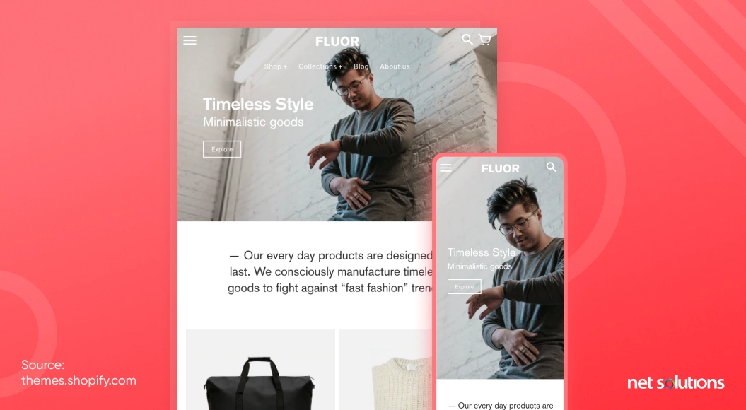
A powerful mobile experience is vital. With over half of all eCommerce transactions taking place on mobile devices, it will impact your business if you haven’t taken the time to optimize your eCommerce site for smartphones and tablets. Here are a few pointers to help you –
- Check your website using Google’s mobile-friendly test tool. This free tool lets you know how easy it is for mobile visitors to use your page and pinpoints any issues (e.g., text too small to read, clickable items too close together).
- A navigation bar icons feature labels, so users know what each button does.
- Call-to-Action (CTA) buttons stretch across the mobile screen, allowing visitors to click with either hand.
- Clickable elements are not clustered too closely, making them harder to click.
- Visible, readable headers.
- Shopping cart icon is easy to find on mobile screen
- Forms optimized for mobile devices
- Categories display two or three images per line
- Visitors can swipe to scroll through product choices. Swiping is essential since visitors are used to performing this action on other websites.
- Optimized mobile links to FAQs, shipping follow-up, return and canceling policies, and privacy policies.
6. Site speed and performance
- Leverage browser caching
- Optimize and scale images
- Combine images into CSS sprites
- Minimize redirects
- Enable compression
7. User experience and design
Ask questions –
- What impression does a user have when they arrive at your website?
- What do users see when they type a term into the product search?
- What comes in users’ mailboxes after registering, changing their password, subscribing, or purchasing?
- When users take specific actions, such as new registrations, purchases, subscriptions, etc., how are they thanked?
- What happens if a consumer accesses a product page that says it’s out of stock?
- What will happen if a user looks for a thing that doesn’t exist?
Your users will stay when you have straight answers to the above questions.
Homepage
Aside from the elements mentioned above in the “Pre-checkout” section, a few key elements apply specifically to the homepage. Double-check these since much of your traffic will enter your site from the homepage. Content speaks to three main types of visitors:
- Returning visitors who often want product recommendations based on past purchases
- Deal-seekers who want to find discounts
- Exclusive shoppers who want to see new and limited-edition items
So, your banners must have attractive CTAs that attract conversions. Don’t forget to eliminate carousels, as studies show they harm conversions!
8. Clear value proposition and messaging
Your website’s homepage should immediately communicate what your business offers and why it’s unique through a headline, subheading, and supporting copy or imagery. Avoid using technical jargon or industry-specific language that may confuse or turn off potential customers.
9. Promotions and featured products
- Use eye-catching banners or graphics to draw attention.
- Consider using a countdown timer or limited availability messaging to create a sense of urgency.
10. Social proof and credibility indicators
- Add customer reviews, ratings, trust badges, and social media followers or engagement metrics.
- Make sure these elements are displayed prominently and easily understood.
11. Search bar and the navigation menu
- Ensure your navigation menu is intuitive, easy to use, and includes all your product categories or pages.
- The search bar should be prominently displayed and functional, allowing visitors to search for specific products or keywords.
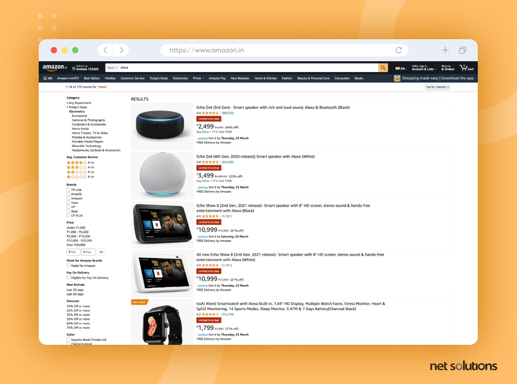
Listing and category pages
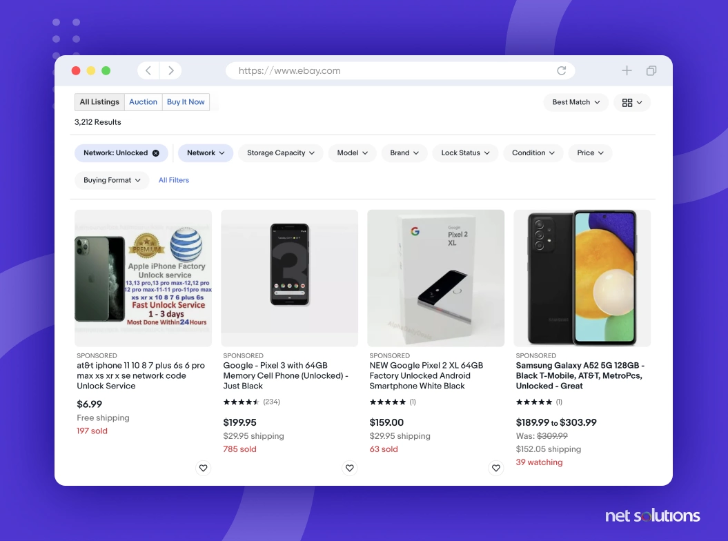
These pages will show a range of products; optimizing them is vital. It’s where your customers will decide whether your website offers the breadth of products they want at the correct prices.
12. Clear product categorization and filtering options
- “Strike-through” graphics for discounted items
- Percent discount noted on discounted items
- Eye-catching colors on essential items such as “Buy One, Get One Free”
- Product images placed above the fold (that point where the content cuts off on most monitors and users are required to scroll)
13.Product sorting and ordering
- Filter options that allow users to sort items by specific features, top sellers, etc.
- Ascending/descending ranking and sorting options (based on price, relevance, etc.)
14. Product images and descriptions
- Clear compelling product description summaries:
A. Product name
B. Photo
C. Details
D. Price
E. Any other relevant info
15. Product reviews and ratings
- Minimal advertising so as not to overwhelm the visitor
- Unavailable products featured at the end of the list
- Side-by-side comparisons of different products, when appropriate
Product detail pages
The product page is where the actual sale happens, and the customer closes the deal. Or, if your page needs to meet customer expectations, you inadvertently send them to another search or website. To ensure conversions at this point, your product pages must include all the information visitors need to decide.
16. Product title and description
- Category and subcategory filters that are accurately named make it easy for visitors to filter results.
- Ascending/descending ranking and sorting options (based on price, relevance, etc.)
- Featured products are visible above the fold (the point where the content cuts off on most monitors)
- “No results” page includes a CTA prompting them to search by other keywords or including ads for other products
- Search results tied to the most popular keywords
- Advanced search tool that detects common misspelling and typos, bringing up the items users are most likely looking for
- Results include auto-suggestions
- Search page shows the keyword the visitor searched for
- Search page displays the total number of results
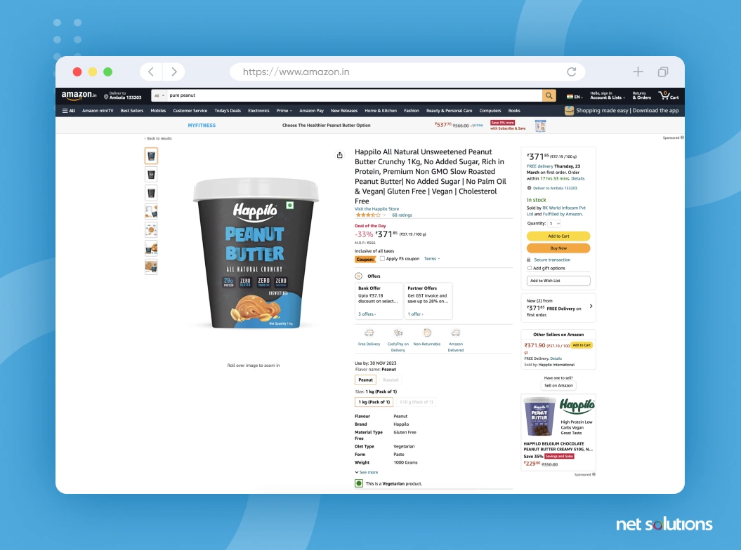
17. Product images and videos
- Large high-resolution photos from different angles
- Image zoom to view details from multiple angles, showing the essential features
- High-resolution photos from different angles
- Detailed product information, including
- Ratings and reviews feature
- Testimonials from satisfied customers prominently
- “Add to Cart” button prominently displayed
- Fear of Missing Out (FOMO) techniques, including –
- CTA above the fold (the point where the content cuts off on most monitors and users are required to scroll)
- Clear pathway to checkout
- Sold-out items show similar alternative products
A. Product name
B. Price
C. Availability
D. Product specs (weight, dimensions, etc.)
E. Any other relevant info
A. Countdown for sales ending
B. “Order Now” countdown (e.g., “Order now and get it by 2 pm on Wednesday”)
C. Display stock levels (e.g., “Only 2 left!)
D. Display number of recent purchases
E. Display number of customers currently viewing the item
18. Pricing and shipping information
- Shipping calculator on the checkout page so shoppers can explore their options
- Range of options displayed, such as different sizes and colors
- Clear reminder to select the size, color, etc., for customizable items
- User-generated content, such as YouTube video reviews
- Question & Answer section where others who have purchased the items can help shoppers find solutions
- Links are minimized to avoid distraction and keep visitors on the page
19. Related products and cross-selling options
- Cross-sell items appear consistently on each product page
- Complementary cross-sell items appear before checkout (e.g., someone buying a coffee maker can also purchase coffee)
Shopping cart optimization
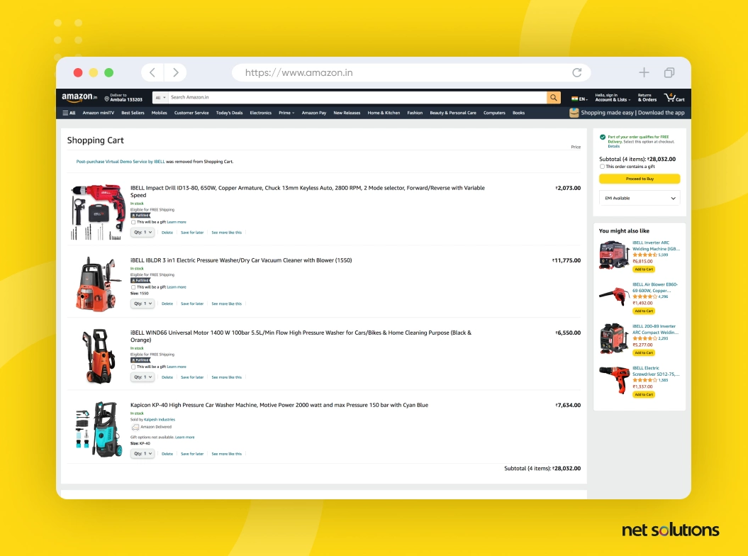
You may think you’re more than halfway to the finish line when someone fills up their virtual shopping cart, but you’d be mistaken! A study from the Barnard Institute found that nearly 70% of all online shopping carts end up abandoned. With this in mind, optimizing your shopping cart to encourage conversions is essential.
20. Cart visibility and accessibility
- Main checkout CTA visible
- Apply some of the FOMO techniques used on your product page –
A. Countdown for sales ending
B. “Order Now” countdown (e.g., “Order now and get it by 2 pm on Wednesday”)
C. Display stock levels (e.g., “Only 2 left!)
D. Display number of customers who recently purchased the item
E. Display number of customers currently viewing the item
21.Cart editing and updating options
- Easy access to changing quantity
- Easy access to removing products from the cart
- Ability to save products for later
- Cart holds products for unregistered customers for 30 days
- Registered customers can access the cart from different devices
- Logos that communicate secure checkout, SSL encryption, etc.
- Availability (i.e., number in stock) is clear before checkout, so customers aren’t disappointed when they can’t get the quantity they want after clicking “Buy”
22. Promotions and discounts
- Clearly display discounts and offers
- Option to add promotions
23. Upselling and cross-selling opportunities
- Complementary products/cross-sell opportunities displayed
- Discount code field displayed.
- Free shipping re-emphasized when selected
- A clear estimate of delivery day and time
- Available payment options displayed
- System for sending automated emails to abandoned shopping carts for registered users, reminding them to make the purchase.
- Different colors to differentiate the “Continue Shopping clearly” and “Checkout” buttons
Checkout process
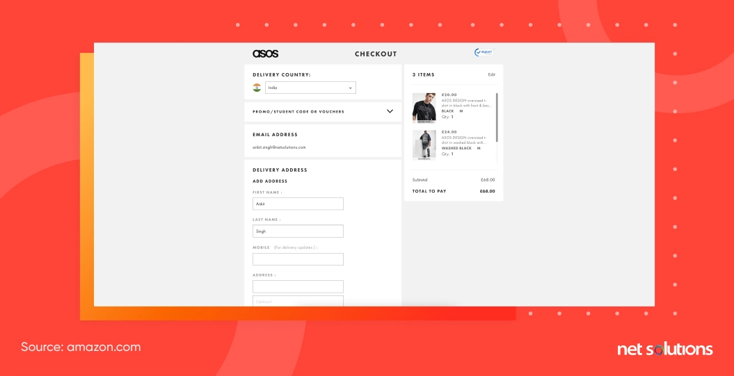
The checkout process is where the rubber meets the road. If you can make checkout painless, you can close the deal. And each time you successfully sell to a customer, their odds of returning increase, paving the way for long-term revenue.
24. Guest checkout and account creation
- Guest checkout feature for those who don’t want to create an account.
- Registration option for first-time customers.
- Single-page checkout that makes it easy for shoppers to purchase.
- Email requested at the start of the checkout process so you can follow up if they don’t complete the purchase.
- Vertical form with clear, non-disappearing labels.
- Clearly distinguished mandatory and optional fields.
- Form validation for all fields. This lets customers know immediately when they’ve filled out a field incorrectly.
- Guidance on correcting entry errors (e.g., “This field requires a valid email address”)
25. Form fields and data collection
- Form field Pre-fill capabilities to expedite the process.
- Option to save credit card information for repeat customers.
- Enclose the credit card form in a separate section. Studies show this makes shoppers feel more comfortable about giving you their information.
- Visual prompts to show where shoppers can find requested information on their card (e.g., where to find the CVV code on the back of the card)
- Bold, descriptive CTA buttons (e.g., “Buy Now”)
- Main CTA stands out to encourage action
- Registration process is simple (avoiding unnecessary requirements for things like password selection)
- Progress bar for sites with multiple checkout pages. This lets shoppers know there’s an end in sight, so they’re less liked to leave without purchasing.
26. Payment options and security
- Wide variety of payment options
- Prominent seals conveying security and trust (such as SSL logos)
27. Confirmation and thank-you pages
- Order summary page that clarifies the purchase hasn’t occurred yet, preventing shoppers from assuming it’s a “Thank You” page and leaving.
- Option to order or address changes on the summary page without starting over
Post-checkout and ongoing optimization
28. Order confirmation and delivery updates
- Send a confirmation email immediately after checkout with details about the order and estimated delivery date
- Send shipping and delivery updates to keep customers informed about the status of their order
- Include links to track orders or contact customer support for any issues or questions
29. Abandoned cart recovery strategies
- Use retargeting ads or emails to remind customers of items left in their cart and encourage them to complete their purchase
- Offer discounts or free shipping to incentivize customers to return and complete their purchase
- Make sure the checkout process is easy and streamlined to reduce the likelihood of abandoned carts
30. A/B testing and data-driven optimizations
- Continuously test and optimize website design, messaging, and marketing campaigns using A/B testing and other data-driven approaches
- Monitor website analytics to identify areas for improvement and track progress toward goals
Use tools like heat maps or user recordings to understand how visitors interact with your website and identify areas for improvement
31. Customer feedback and reviews
- Collect customer feedback through surveys, reviews, or social media to understand how customers perceive your brand and identify areas for improvement
- Use customer reviews and ratings to provide social proof and encourage trust with potential customers
- Use feedback to make improvements to the website, product offerings, or customer service to increase customer satisfaction and loyalty
Improving your ecommerce store over time
All the eCommerce website development and optimization tips we’ve included in this blog post and the free guide accompanying it are considered “best practices,” meaning they’ve worked for other sites across different industries.
Every customer base is unique; you’ll see how customers respond to your website over time. You can use CRO experts’ help to A/B test different elements and determine what works to boost sales. It will help refine your eCommerce site to widen profit margins and outperform your competition.
If you’d like expert guidance in your ecommerce efforts, Net Solutions provides comprehensive eCommerce Development services to fit any strategy. We’re well-versed in the latest trends and can help you plot the course for a fully modernized eCommerce business—so let’s set up a time to discuss your needs!
Frequently Asked Questions
Conversion rate is the metric we use to measure conversions on an eCommerce website. Here’s how you can calculate it:
Conversion rate = Number of conversions/ Total number of ad interactions during this period.
For example: If you had 50 conversions from 1,000 interactions. The conversion rate will be (50/1,000)x100 = 5%.
1-4% of total website traffic is considered a good conversion rate for an eCommerce website. The average conversion rate is 2.63%.
Speaking of Amazon, the average conversion rate for Amazon listings is 10-15%. The conversion rate for Amazon Prime members is more than 70%.
- The value you’re offering.
- Relevance to website visitors.
- Clarity in communicating the value.
- Distractions.
- Sense of urgency.
- User Experience (UX) Design.
- Quality Product Content.
- Marketing and Promotion.