
Landing pages are an integral part of any eCommerce business. Essential to your inbound marketing strategy, they move your visitors through your sales funnel to turn them into a lead, or even better, a conversion.
It stands to reason, then, that creating great eCommerce landing pages is crucial to growing your business and increasing your bottom line. So what qualifies a landing page as effective? The most successful ones have a few things in common:
- A clear, singular offer
- Punchy copywriting that compels the visitor to take action
- A design that supports great user experience and includes compelling imagery to support the product
- A focused call-to-action
Read on to learn how to create eCommerce landing pages that convert.
Clear, Crisp Content
How you present your product or service makes or breaks your landing pages. The importance of content can’t be overstated — it’s the mortar that holds everything together. Your headline, copywriting, testimonials, and the particulars of your offer guide visitors through your landing page. A landing page with well-crafted content convinces and entices a user to take action.
All of the content on your landing page should work to communicate the benefits. You can’t simply tell your visitors the features you’re offering; you have to tell them why it’s going to make their life easier, better, or happier.
You also need to communicate these benefits as clearly and concisely as possible. Don’t use filler words or padded content — get straight to the point.
Attention-Grabbing Headlines
Your opening headline should be the main statement about your entire landing page. It should tell visitors what your product is and how it will benefit them in as few words as possible.
The Proof is in the People
Human beings are social creatures. As such, we’re influenced by how other people think and feel about a particular thing. This is precisely why testimonials from other customers or reviews from well-known publications work so well.
Design Matters
Many visitors won’t purchase from a website with a bad design. The same goes for a landing page. So what makes for a great landing page design? Three things are key:
- It should be clean, concise and easy-to-use
- It should perform well on all devices
- And of course, it should be beautiful
We respect your privacy. Your information is safe.
Design for the User
You’ve probably heard about the concept of user experience design. If you haven’t jumped on board with the idea by now, here’s a statistic you might find interesting: For every $1 invested in UX, you can expect a return of $100.
User experience design has to do with how a website looks, how easy it is to use and how it behaves across all manner of devices. An effective landing page needs to be attractive and functional on any device a visitor happens to be using, whether it’s their desktop, tablet, or phone.
Pages also need to be fast. A typical visitor won’t wait longer than a couple of seconds for a website to load. If it takes any longer, they’ll simply back out and take a look at one of your competitors.
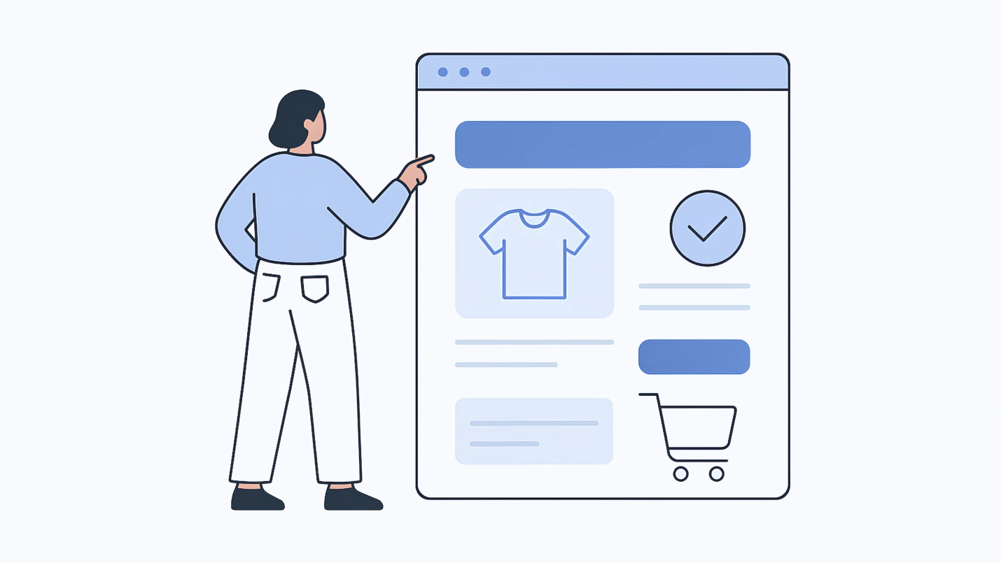
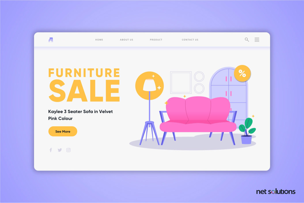
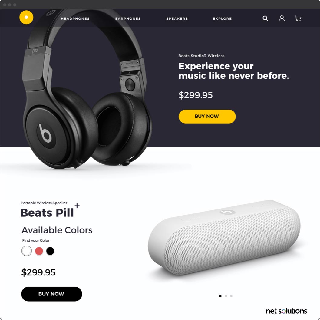
Beautiful, High-Quality Images
Great product images grab a visitor’s attention and hold it. Pixelated, low-quality images or stock photos do the opposite. If you want a truly effective landing page, you need to have images that show your product clearly and in a good light — literally and metaphorically.
A great landing page uses an attractive, high-resolution photo as a masthead. Think of landing pages that showcase their product in full width across the top of the page. This is the kind of imagery you want to aim for on your own landing pages.
Outbound Links
A mistake that many e-commerce businesses often make is assuming landing pages should be a part of their website’s typical hierarchy. While your landing pages should match the theme and branding of your website, they should stand alone as their own entities.
This means you don’t want to include your website’s typical navigation and footer. In fact, you want to have as few links as possible on your landing page. The goal is to convince visitors to engage in one single action — you don’t want to lure them away to some other part of your website.
Instead, guide your visitors down the page and through to your CTA. You have a very clear goal with your landing page: Get your visitors to take an action.
An Effective Call-to-Action
Your CTA is the single most important aspect of a landing page. It’s the reason you have a landing page in the first place. Everything on it serves to guide your user down the page and convince them to take action.
As such, your CTA should be singular. If your landing page’s intent is to sell a product, don’t dilute it by including multiple offers. This confuses your potential customers. Keep it focused entirely on the benefits of your product and use your CTA to compel the visitor to convert.
It should also be simple. A CTA should be as frictionless as possible. Don’t overload your visitors with unnecessary form fields or multiple buttons. Give them a single option when possible: Click on the big bright button.
Examples of Effective eCommerce Landing Pages
One of the best ways to learn how to do a thing well is by studying great examples. Take a look at some great examples of landing pages from various brands below.
1. Blue Apron
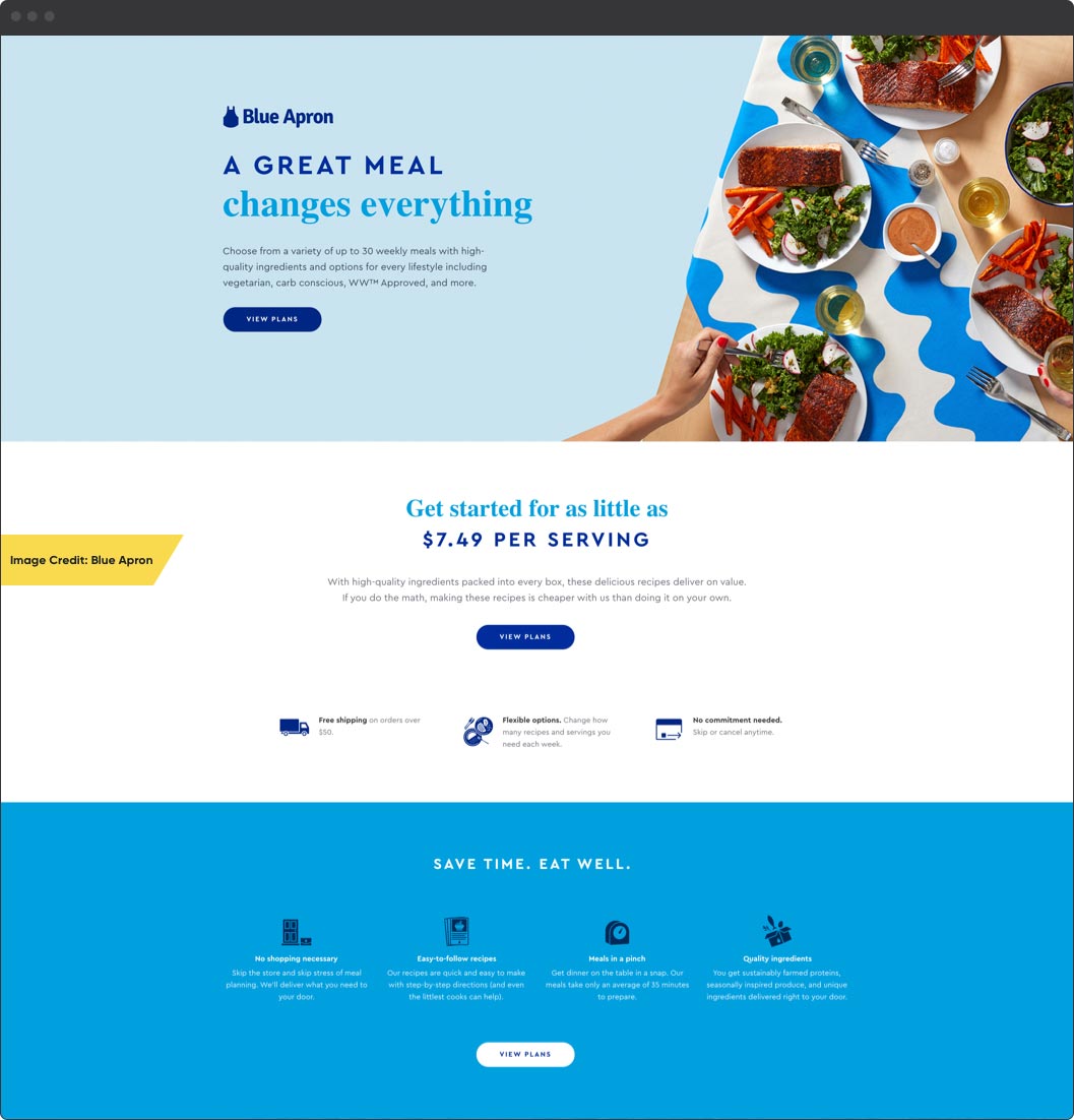
This landing page from Blue Apron hits all the right marks. It has beautiful imagery, a short, punchy title, and a convincing copy to support a single message: Choosing Blue Apron makes you healthier and happier while making cooking for yourself easier and more efficient.
Take note of the design’s simplicity. There are few links on the entire page, save for contact information and privacy policies in the footer. The main action to take here is “Get Cooking.”
2. Winc
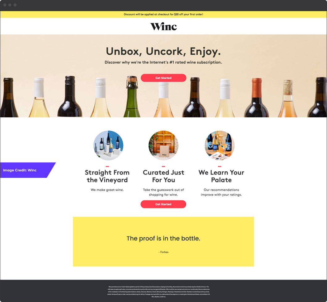
Winc’s landing page is a great example of punchy and concise copywriting. The headline — a mere three words — perfectly describe what the product does and how it benefits the customer.
The header image is high-quality and engaging; it communicates that this product isn’t about a single bottle of wine, it’s all the bottles of wine.
Winc has also included social proof in the form of a quote from Forbes, a well-known publication. “The proof is in the bottle.” It doesn’t get any more succinct than that.
3. Axis
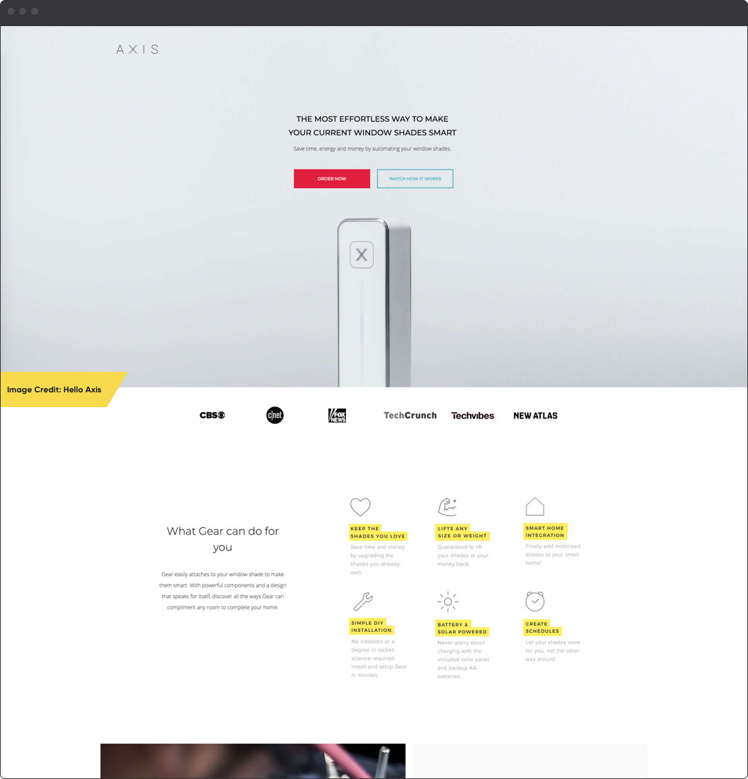
This page from Axis is another great example of thoughtful design. While it does bend a few of the rules — there’s an outbound link or two — it’s incredibly well executed.
The imagery shines; the header shows the clean and elegant design of their product. As you move through the landing page, the content describes concisely what the product is and how it benefits you. Axis also makes ample use of social proof and it even creates a sense of urgency near the bottom with a “Sold Out!” mention in its shipping information
Create Landing Pages for Your Visitors
When put into practice, the principles laid out here can substantially increase the effectiveness of your landing pages. The ideas are generally pretty straightforward, but that’s not to say each of them is necessarily easy. Writing great copy, taking fantastic photos, and wrapping it all together in a design that moves a user through your landing page takes some time and expertise. But it’s more than worth it — after all, few things have the effect on an eCommerce company’s bottom line than an excellent landing page. If you’re looking for a proven ecommerce web development company to help take your e-commerce project to new highs, don’t hesitate to get in touch.
Moving forward, keep these ideas in mind and you’ll no doubt turn your landing pages into effective machines that produce new leads, new customers, and a set of better eCommerce solutions.