

Mobile-first design prioritizes the needs and experiences of mobile users by designing for small screens first, then scaling up to larger screens. This approach leads to simpler, faster, and more intuitive interfaces that meet the expectations of today’s on-the-go users.
Ready to have your mind blown? Currently, more than half of the world’s internet users—some two billion people—access the internet from only a smartphone. No laptop, no desktop, just a mobile device that fits in their pockets.
What’s even more astounding is that the number of smartphone users, which was 4.88 billion in 2024, jumped to 5.28 billion in 2025. This growth means that approximately 57% of the global smartphone user base now accesses the internet exclusively through their device.
These numbers explain why mobile traffic continues to dominate, and it’s why so many companies have been prioritizing mobile optimization for websites and web-based software platforms over the past decade.
Back in 2010, Google’s (then) CEO Eric Schmidt predicted this change at the World Mobile Conference, and that’s where he coined the term “mobile first design.” At the time, developers and designers built websites primarily with laptops and desktop computers in mind, but Eric Schmidt saw the writing on the wall.
In the years that followed, mobile first design took center stage, and it guides most serious development projects today.
What is Mobile-first Design?

Mobile-first design is an approach to website (and web-based app) design that begins with designing for mobile devices—smartphones in particular—before adapting design for larger screens. No wonder a divergent evolution is the increasing technological advancement, relevance & prioritization of mobile application development in tune with the market dynamics.
This stands in stark contrast to the traditional desktop-first approach (also called “graceful degradation”), which begins by designing for larger screens and then pairs that design down for tablets and phones. The problem with a desktop-first approach is that it’s harder to adapt large-screen elements and design to smaller screens. Plus, as mobile traffic continues to eclipse desktop traffic, it makes sense to employ a mobile-first philosophy in many cases.
While Eric Schmidt first coined the phrase “mobile first,” it was Luke Wroblewski and others who pioneered the mobile-first philosophy itself—which they also called “progressive advancement.” The idea is that they would begin with core features and elements that fit onto the smallest screens, and they would gradually add secondary features that larger screens could accommodate.
Why Mobile-first Design is Important
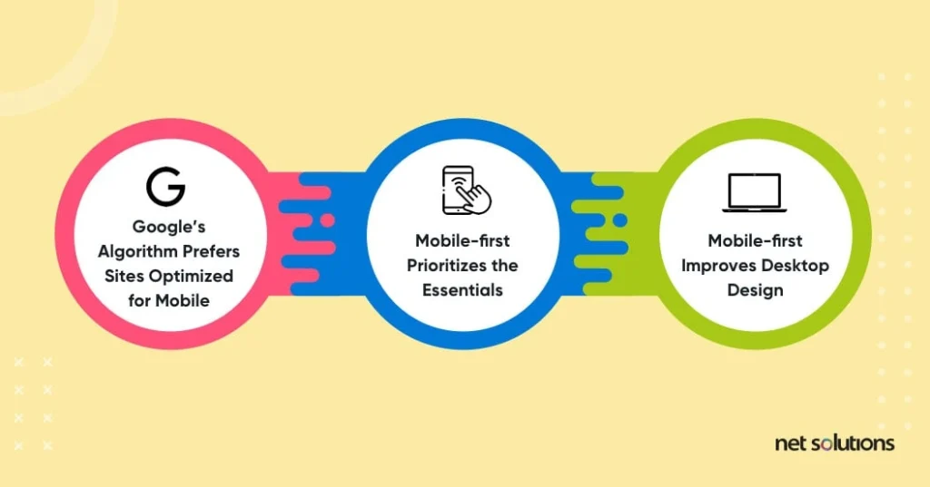
Mobile-first design has a number of advantages over the desktop-first approach. Beyond the obvious need for a quality mobile experience based on changing device preferences, the mobile-first approach has the following benefits.
Google’s Algorithm Prefers Sites Optimized for Mobile
Google engineers are intimately familiar with the rise in mobile traffic, and they’ve designed their search engines to prioritize mobile-optimized websites.
Want to rank higher? Make sure your website is mobile-optimized, and understand that one of the best ways to do that is to take a mobile-first approach.
Mobile-first Prioritizes the Essentials
A mobile-first approach is a different way of looking at design. When web designers work with the small screen in mind, they think in terms of a fundamental, streamlined User Experience (UX). This approach leads to more functional websites that prioritize content, along with superior software that is highly usable.
Mobile-first Improves Desktop Design
Superior mobile design usually leads to superior websites across the board, including the desktop versions.
Designers can always add more bells and whistles to the desktop app as their design progresses to larger screens, but starting with small screens helps them focus on what’s truly important.
What is the Difference Between Mobile-first and Responsive Web Design?
You’ve probably heard of responsive web design, and you may wonder if it’s just another way of talking about mobile-first design, but they’re actually two very different concepts.
Responsive design takes a website designed for desktop use and automatically adapts it to smaller screens when visitors access it from mobile devices. It shrinks font sizes and moves elements so they’ll appear in an order that makes sense and doesn’t cut text or result in overlapping elements. Responsive design uses something called a “fluid grid” to change the layout based on each device’s dimensions.
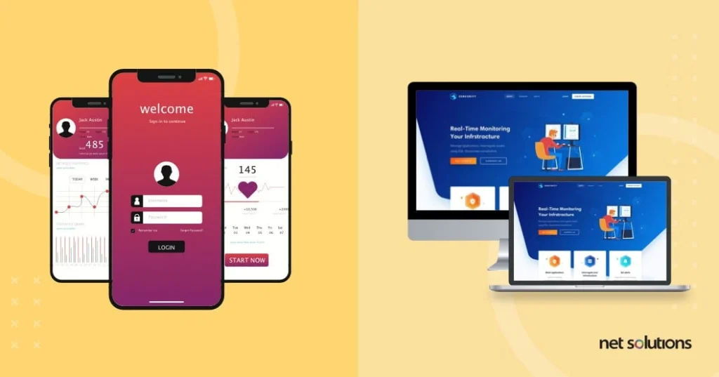
Mobile-first design, on the other hand, begins by asking how the content will appear on a mobile device. It’s also “responsive” in the sense that the mobile version of the website will adapt to different screens (from the Galaxy Note20 Ultra’s massive screen to the Mini Smartphone iLight 7’s tiny screen). However, the mobile design remains distinct from the desktop design, so it’s not “responsive design” in the way we normally think of it.
To recap, responsive design begins with the desktop site and employs technology to adapt that desktop design to smaller devices. Mobile-first begins with smaller devices and uses that design as the foundation for creating the desktop site, which has its own, unique design.
How to Implement the Mobile-first Design Approach in Product Design

As with all website and app design philosophies, a mobile-first approach begins with looking at the product from the user’s perspective. Mobile-first designers focus on the smartphone user’s needs at the first design stage and expand their focus to tablets and desktop designs. These design first practices help in curating profitable businesses.
Let’s say, for example, an automotive services chain that performs oil changes wants a new corporate website based on the mobile-first approach. The designers would likely prioritize elements like:
- Location search, with a “Search Nearby” option for any visitor willing to share their location
- Call-to-Action (CTA) buttons designed for smartphones, letting visitors call their local shop with a single tap
- Special offers and coupons to encourage immediate action
- Key selling points, such as “No Appointment Needed” or “Free Brake Fluid Top-offs”
- Additional services, like tire rotation or vehicle inspections
The designers would create mobile wireframes that outline when and where this information would appear, seeking to maximize conversions. When designing the desktop version of the website, designers would change the layout to fit a wider horizontal space, but the mobile layout provides a North Star in terms of prioritizing content. After all, the goal is the same: Conversions.
9 Best Practices for Mobile First Design

Every website is unique, and requires its individual approach to design. That said, mobile-first development teams have identified many best practices over the past decade while developing mobile app solutions.
Use these mobile first best practices as your guide, and you’ll be on your way to creating a high-converting, mobile-first software product.
- Prioritize Content Before Other Elements Remember the old cliché: “Content is King?” Well, it stuck around because it’s as relevant today as it ever was. The best way to create a website that converts is to think long and hard about your content, prioritizing what works and avoiding fluff.
- Make All the Page Elements Visible and Consistent When designing for small screens, you’ve got very little space to play with, and you’ll want the most important elements to stand out.
Ask yourself: Can visitors find what they’re looking for instantly? Does your design confuse them and scatter their attention, or do they know exactly where to go?
Including highly visible, consistent page elements will reduce confusion and inspire action.
- Make Your Pages Easy to Navigate In Don’t Make Me Think, a classic book about usability, Steve Krug argues that effective websites demand the least possible mental exertion from their visitors. The more you make them think, the less likely they are to convert.
Intuitive navigation is key for any website, but it’s even more important on mobile devices because the space is so small and there’s very little room to add elements that guide users. If you make it too hard for them to get what they want, they’re on to the next website.
What do we mean by “intuitive?” Use tried-and-true navigation features, such as compact hamburger menus that users recognize. When they see that stack of horizontal lines, most will know to click on it to access more menu options.
- Ensure Your Pages Load Fast Here’s a frightening statistic:53% of visitors will leave a mobile webpage if it doesn’t load within 3 seconds. That’s not encouraging, considering that the average load time on a 3G network is 19 seconds, and the average load time on 4G is 14 seconds.
This might sound strange since most of the websites you visit probably load much faster, but it makes sense if you think about it. Those websites are ahead of the pack in terms of load speeds, but that’s part of the reason you keep coming back.
Of course, you don’t have any say over the network speed your visitors use, but you can control the controllable by choosing the right host, providing a simple, streamlined experience, and making sure your code isn’t bloated (i.e., excessive and convoluted). Here at Net Solutions, we build products using systems like Agile and the 12 Factor App methodology to write clean code and create an optimal user experience.
- Avoid Large Graphics Save the large graphics for the desktop version of your site (if needed). Those large images may be effective when they span the length of a horizontal desktop screen. A large image on the mobile site, however, will likely stretch beyond the mobile screen’s fold and take up valuable real estate better used for persuasive content.
- Bold and Consistent Calls-to-Action (CTAs) Make sure your CTAs pop. After all, your goal is to convert. Whether that’s getting your visitors to buy a product, book a demo, download a lead magnet, or something else, your CTA is the most important element on the page.
Things to think about when designing your CTAs:
- Color of the buttons
- Shape of the buttons
- Effective CTA copy that tells visitors what to do (e.g., Book a Demo, Get Started)
- Clear text: Large enough to read without glasses
- Ideal Positioning: Does it jump out against the background?
- Avoid Disruptive Pop-ups Pop-ups are annoying, but they often have their place on desktop sites. Pop-ups on mobile sites, however? Almost never a good idea.
Tapping that tiny “X” in the upper right-hand corner to close a mobile popup requires ninja-like precision (or tiny little fingers). Plus, when you consider that more than half of all mobile users leave after a site doesn’t load in 3 seconds, it’s just not smart to test their patience further.
- Test on Real Devices It’s one thing to see how a website will theoretically look as your developers code it, but it’s something else entirely to see how it behaves on actual devices. Fortunately, there are services that can test your site on a range of Android and iOS devices to ensure that everything works the way you expect it to work.
- Keep the User in Mind In case we haven’t been clear so far, you should always, always, always design with the end-user in mind. Your content, your imagery, and your layout should make their lives easier.
Thinking of adding a cool effect just because it looks good? Do so at your own risk.
Mobile-first Design Process (4 Steps)

When designing a website or platform guided by the mobile first philosophy, there are a number of things to keep in mind. Following a defined process keeps teams on track and aligns them in the larger mission. The steps that follow will help you design and build a mobile website that’s more likely to convert.
Step 1: Organize Your Content
Create a spreadsheet for each page that clearly identifies each piece of content you want to include (e.g., hero text, section headers, supporting text, links, buttons), along with its purpose.
Remember, everything you include on that small screen takes up valuable real estate, and seeing every element you’re thinking of including will help you sort through it all and select the most essential ones.
Step 2: Create a Visual Content Hierarchy
Now that you know everything you might want to include, it’s time to identify the most essential elements. Place the things you absolutely want them to see at the top and remove anything that seems like a distraction. And remember, when you’re designing for mobile, you’re dealing with a narrow, vertical screen space. That means each element will come at them in a linear, sequential order, so prioritizing is where it’s at.
Step 3: Design Mobile Wireframes with the Smallest Devices in Mind
Remember what we said about responsive design vs. mobile first design?
While traditionally, responsive design refers to adapting desktop sites to mobile devices by shrinking them and reordering the layout, there’s a “responsive” component to mobile first design (as we mentioned earlier). After all, smartphones vary considerably in screen size. Again, it’s just not “responsive design” in the way we normally think of it.
We’re going to get a bit technical here for the designers and developers, but what this means is that you should begin by designing for the smallest breakpoints—expanding incrementally to larger breakpoints. This helps ensure that things will look right on any device.
Pro Tip: Avoid hovers and larger graphics when designing for mobile devices.
Step 4: Test on Real Devices
There’s theory, and then there’s reality when it comes to mobile design.
You can play around all you want with software that emulates different smartphone layouts, but testing with real devices is where the rubber meets the road. When you find things that don’t quite work (or don’t work at all) on real mobile devices, you can tweak them until they do.
The Ultimate Aim? Usability

What is the main benefit of mobile first design? The mobile first philosophy is all about usability. By prioritizing simple, straightforward content that leads to conversions, it reminds us that websites are worthless if they don’t do what we want them to do.
Designing for smaller screens and expanding to larger ones is great for that ever-growing number of mobile visitors, but it’s more than that. The mobile first approach reminds designers, developers, entrepreneurs, and business leaders to build websites that prioritize usability for desktop users and mobile users alike.
The bottom line is that usable websites convert. And who doesn’t want more conversions?
Frequently Asked Questions (FAQs)
1. What is mobile-first design?
Mobile-first design is a strategy where the user experience is first designed for mobile devices and then adapted to larger screens like tablets and desktops.
2. Why is mobile-first design important for apps?
With most users accessing apps on mobile devices, designing for mobile first ensures better performance, usability, accessibility, and engagement across all screen sizes.
3. How does mobile-first design impact usability?
It streamlines interfaces, prioritizes key tasks, reduces clutter, and improves speed, which results in easier navigation and higher user satisfaction.
SHARE THIS POST
Table of Contents
Related Resources
- What is App Store Optimization (ASO)? The in-depth guide for 2025
- The Mobile App Architecture Guide for 2025
- 7-Step Mobile App Development Checklist (Free Download)
- How Much Does it Cost to Build an App [A Complete Breakdown]
- How To Protect Data In Mobile & Web Apps Using Encryption
- eCommerce Mobile App Development: A Step-by-Step Guide
- 7-Step Mobile App Development Checklist (Free Download)
- How Firebase is Emerging as an Innovation in App Development
- A Complete Guide to Implementing In-App Purchases
- Low-Cost Mobile App Development: A Comprehensive Guide
- How to Make an App in 2025: 5 Stages of Mobile App Development
- The Ultimate Guide for New App Ideas
- Offshore Mobile App Development: An In-Depth Guide
- Most Popular Programming Languages for Mobile App Development
- 7 Mobile App Development Tips for Acquisition & Retention
- Top 15 Mobile App Development Trends to Watch for in 2025
- The Fundamentals of Android App Development: Basic Tutorial