

A good dashboard design should be able to effectively and quickly communicate the required information to the user. Like what a car dashboard design does by letting you check your driving speed, how much fuel you have in your tank, and so on.
Any app or website that urges users to register for an account must have a dashboard. Also, dashboards are indispensable if businesses invest in data management tools for sound data analytics. Whatever the case, a dashboard design should be easy to navigate, intuitive, and understandable.
Here’s more about dashboards, design principles, and the key considerations that help understand how to design a dashboard.
What is a Dashboard?
A dashboard is a data-driven user interface that collects and showcases information in a visual format.
The function of a dashboard in businesses is to give ongoing outcomes by amassing and extracting value from all the collected data, known as key performance indicators (KPIs).
It rearranges your data into manageable chunks of visual data that permits you to see how you are doing and where you must improve. Dashboards have been continuously evolving, and to create an impressive dashboard design; it’s essential to be aware of the latest UX design trends.
When used appropriately, dashboards can add to the data analytics services and assist you in making an informed decision that affects business execution.
Three Types of Dashboard Designs
The purpose of a dashboard is to drive activity. In this data-driven world, numerous dashboard types are changing the way effective businesses process insights. A healthy way to deal with your business development is to convey the right information to suitable individuals. Otherwise, long-term success can be jeopardized and expensive.
That is the reason why choosing the right type of dashboard can bring enduring and financially profitable results.
Here are the three types of dashboard designs:
-
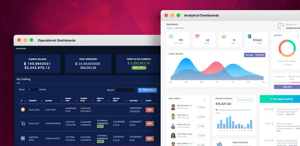
Operational Dashboard
The operational dashboard helps users in carrying out data-driven actions. The data is frequently updated and requires the user to glance through it now and then.
Financial trading apps are examples of the operational dashboard design — where real-time information regarding financial assets is displayed along with enabling users to buy and sell stocks.
-
Analytical Dashboard
The analytical dashboard displays large volumes of data to help users interpret the information (visual format).
Data analytics dashboard designs are typically used where the purpose is to compile these large volumes of complex data to allow businesses to understand and infer meaningful insights.
Google Analytics, for example, is an excellent example of an analytical dashboard.
-
Strategic Dashboard
A strategic dashboard is a reporting tool for monitoring the long-term company strategy with the help of critical success factors. This dashboard is usually tricky in its creation and provides an enterprise-wide impact on a business.
It is mainly an enterprise dashboard design type used by senior-level management. It tracks performance against your KPIs to better align actions with strategy.
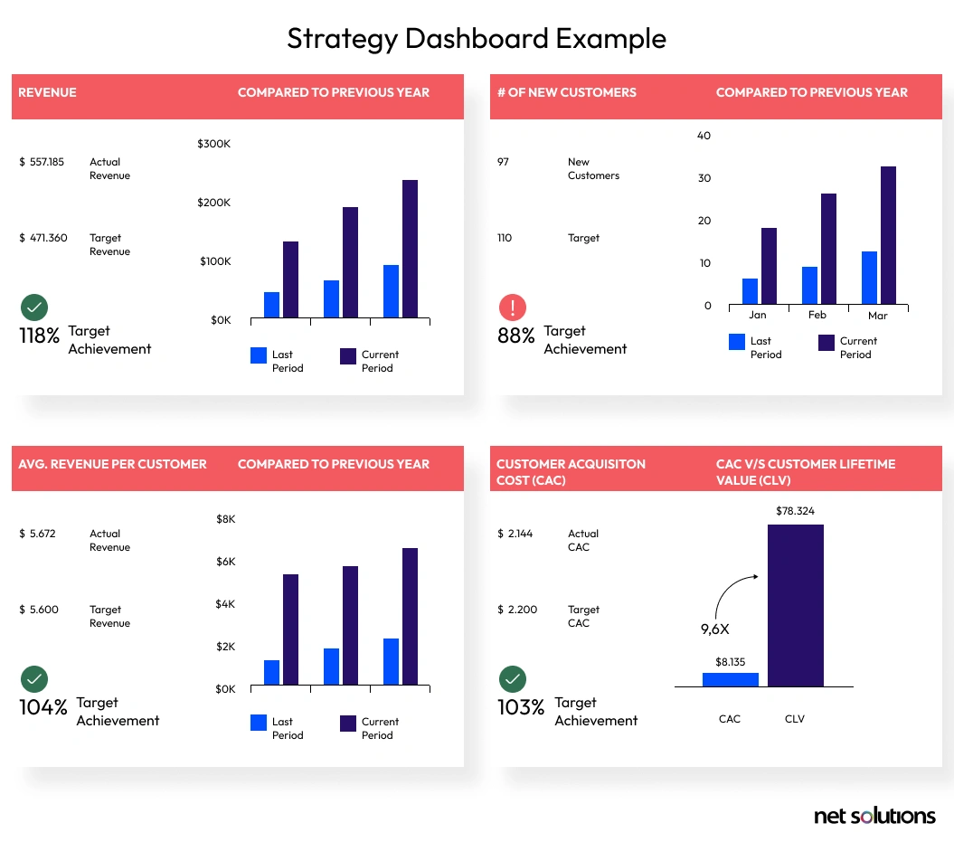
As a result, a strategic dashboard tends to summarize performance over set time frames — either monthly, quarterly, or yearly. For instance, Hubspot’s CRM can be labeled as a strategic dashboard where a business can view and manage all the traction occurring along the sales funnel.
Overview of Good Dashboard Design
Principles
When designing dashboards, it is essential to learn the basic Gestalt principles of visual perception, apart from exploring how to convey actionable information in a context vividly.

Gaining a sound understanding of these principles of effective dashboards can enable you to devise a better dashboard structure, besides making your charts more straightforward to translate.
Here is an insight into each of them:
-
Proximity
It means the tendency to see multiple elements as groups when positioned close to one another. For example, we can visually distinguish the clusters on a scatter diagram by merely grouping the dots that lie firmly.
-
Similarity
Brain’s natural response is to associate the elements that appear like one another (e.g., in shape, orientation, size, or color). For example, when looking at a color-coded bar chart, readers can easily associate the bars that have been presented in the same color, even if there is no evident mention of their grouping.
-
Enclosure
If a border surrounds a series of elements or objects, they are considered a group. For example, if a scatter diagram exhibits reference lines that seem to be surrounding the objects, say, between 40 and 50 percent, our brain will tend to consider them a cluster.
-
Closure
If we see a figure that seems incomplete, we form a perception that it is a closed structure. Retaking the example of borders, even if we do away with the boundaries that enclose a bar chart, our brain will lead us to consider the axes as the lines that isolate the graph and eradicate the need for extra lines.
-
Continuity
We perceive several objects aligned closely as a continuous body. For example, if the eye starts following an upward trend of line of dots, it will continue to do so until it encounters another object that breaks this continuity.
-
Connectedness
When we see objects connected by any uniform visual property, we will perceive them as a group instead of other elements not connected in this fashion. For example, we consider the dots connected by a frame or a line on a scatter diagram as a group.
What are the Best Practices for Dashboard Design?
Here is a strategic dashboard design approach that should be followed to create useful, usable, and delightful user interfaces.
-
Anticipating the User’s Needs and Goals
The primary objective of a dashboard is to simplify information and propagate understandability. This makes it imperative to analyze the user’s psychology, anticipate their needs and expectations, and understand their requirements before moving ahead with the design part.
Surveys and user interviews can be conducted, and the best UX design trends that work need to be analyzed before finalizing the dashboard design.
Also, creating prototypes can lend a hand here as they showcase how the User experience design will look and feel. Both the stakeholders and the users can validate the prototype later so that there is no loophole left.
-
Choosing the Right Dashboard Visual Design
If your objective is to simply present data, you need to use analytical dashboards. If you also want the user to take some action(s) based on data, an operational dashboard is more suitable.
On the other hand, if you want to track your business’s key performance indicators, a strategic dashboard is the right choice to make.
However, the right dashboard design process, irrespective of its type — should avoid cognitive overload, i.e., displaying too much information in one-go that it becomes confusing to interpret and derive data.
Here’s a comparison table that will help you choose the right dashboard design based on intent.
Operational Dashboard Analytical Dashboard Strategic Dashboard Manages and displays frequently changing information Manages and displays information after analyzing large volumes of related organizational data Manages and displays information against key performance indicators for an organization Frequent updates Updated less frequently, i.e., on a weekly basis Updated on a recurring basis Helps handle daily business processes that require user attention and action every second, minute, or hour Helps strategize and set targets based on existing data and statistics Helps track and manage top-line key performance indicators in the organization. For example, it provides information around how are existing campaigns running It is time-dependent data that needs to be tracked continuously Suitable for tracking trends and gaining deeper insights into the available data Suitable for mapping and analyzing top-line KPIs for an organization -
Choosing Metrics that Matter
Choosing the right metrics to be displayed should hold precedence. This again correlates with cognitive overload, i.e., do not opt for metrics that are not needed as it will only lead to a cluttered design that subsides understandability.
To determine which metrics earn a spot on your dashboard, consider how much detail do you need. The plan should be to provide easy ways for the user to dig deeper into the data in case they need to. So, the lesser is better as far as it serves the user needs.
-
Offer a Complete Picture
The best dashboard designs should provide a snapshot of what is going on and prioritize information on the basis of what the users need to see. All the metrics you choose should combine to tell a holistic story to the user.
To ensure that the information effectively slides into the viewer’s brain, here are the story-like features that you can include in dashboards:
- Set the Plan: Like every good story, the plot should be clear, and problems should be highlighted with a prefigured result. You have to ask yourself the right data analysis questions to explore the data insights. Before presenting the storyboard, make sure who your target audience is and the unique content you are offering.
- Concentrate on Important Elements and Themes: Don’t try to have a thorough record of everything that occurred. A good dashboard design story must include a beginning, a middle, and an end with all the right details. You can add colorful charts and graphs with a customized background to create a cohesive experience for your audience.
- Offer Recognizable Figures to save Readers’ Time: For dashboards, this implies terms, graphics, metrics, and metaphors that are recognizable within the association.
- Levels of Detail: A few components of the story can elevate the whole experience; different subtitles give bits of knowledge and keep up the interest.
-
Using the Right Data Visualizations Elements
Data visualization tools help organize data in a manner that is easily understood. Cluttering your charts with superfluous data labels is only useless and confusing.
Here are a few elements of a good dashboard design that should help you visualize data cleanly and concisely.
- Pie Charts: Use these to show comparative information
- Bar Charts: Use these for comparative information, but with more variables
- Graphs: Use these for measuring trends over a period of time
- Tables: Use these for sorting various variables; for helping organize and communicate meaning
- Line Charts: Use lines for graphical representation of data. These lines include data points that are connected to represent a trend over time

Conclusion
A dashboard is a great way to impart information and other data, particularly with a user-centered, goal-driven design that follows dashboard design principles.
By applying effective dashboard design principles and practices, you’ll guarantee that the users will be able to quickly identify vital information, which will help your product grow its user bases and popularity now and in the long run.
On an ending note, focus on creating a good dashboard design that manifests likeability for your product, is easy to use and interpret in this data-driven world.