
Client
Net Solutions
Industry
Software
Features
Multi-System Data ETL
Contextual IA Switching
Advanced Reporting System
Visualizations with Swift Chart Library
Technology Stack
Success in the fast-paced world today requires company leaders to have a high-level understanding of a wide range of business activities, from operations, to sales and marketing, to customer fulfillment.
Traditionally, managers compile and deliver this information in the form of detailed reports. That is how we did it here at Net Solutions for years, but we came to question that approach, and we ultimately replaced it with an elegant high-tech solution.
What was wrong with the traditional reporting process? The reports, which employees had to compile manually, were derived from data that lived on different systems, and these reports:
As a company that helps others with digital transformation, we decided it was time to build an app for ourselves. The app would provide our C-Suite executives (who we collectively call our CXOs) easy access to the key data they required for important decisions. Our goal was to create an app that gave them a bird’s-eye view of the wide portfolio of projects and business operations they simultaneously oversaw, while also empowering them to deep-dive into the data to glean key insights.
This internal customer success story tells the story of the time we turned our gaze inward here at Net Solutions. After many years of designing and building award-winning apps for our clients, we created an iPhone-based CXO dashboard to help us better manage projects and seamlessly serve our customers.
Using our tried-and-true Agile approach, the Business Analysis team swung into action by documenting our CXO’s requirements and creating user journeys and storyboards. They worked carefully to build finely-tuned paper prototypes of workflows once they understood that different executives had very different needs.
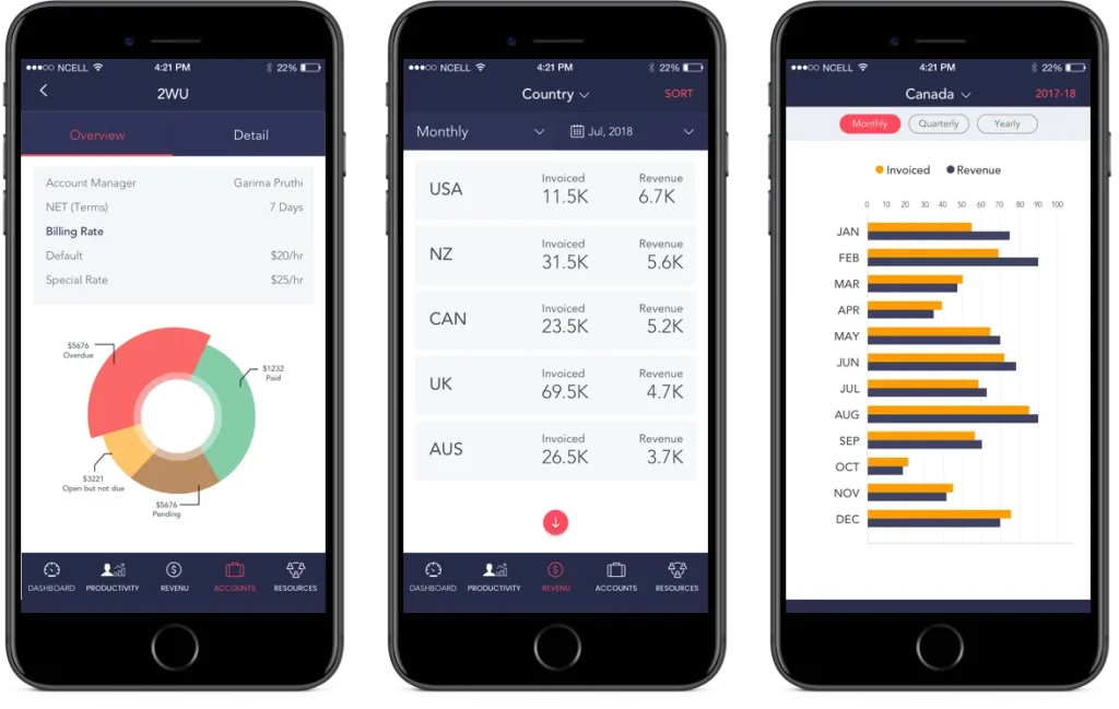
Ultimately, this exercise resulted in a consolidated list of all the data sources required for the CXO Dashboard to function and deliver the reports that each leader required. The platform housed the following separate, but interrelated, dashboards:
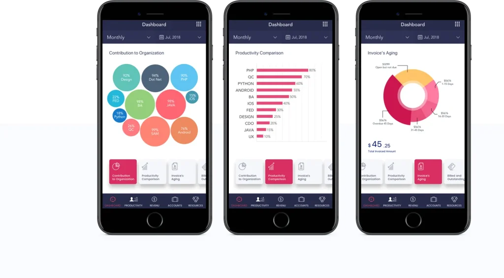
While the final project included three separate dashboards, the prototype originated from the delivery-oriented dashboard. This dashboard combined data from Intranet, our internal productivity system, with Taiga, our project management system of choice. The team also drew data from SonarQube and Mantis, which served as a defect detection and reporting platform. This allowed us to create the initial Projects & Delivery dashboard.
After launching, we enhanced our reporting capabilities by integrating additional systems, such as Jira, for certain projects. This provided CXOs with valuable delivery and tech insights. The development team even worked with the CXOs to define a “health metric” so they could get an instant sense of the “health” of any active engagement.
This dashboard allowed the CXOs to focus their attention on:
In the next phase, we integrated the project with the billing milestones module of Intranet and Zoho invoices, which generated invoices and tracked payments. This made the Operations and Revenue dashboard fully functional, tying both the productivity and the health of the projects to revenue-related Key Performance Indicators (KPIs).
This allowed the CXOs to zero in on:
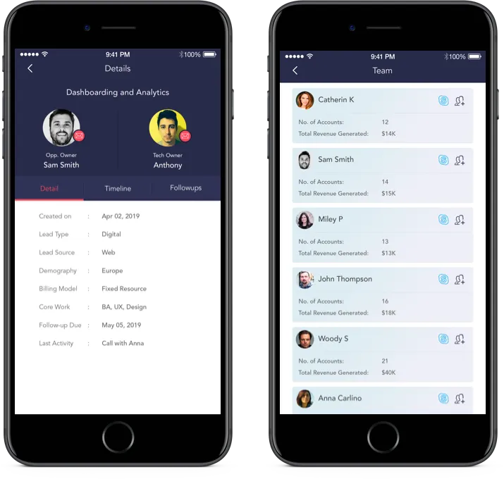
In the third and final phase, we integrated our CRMs, Salesforce and Hubspot, with the new platform. This achieved two important results:
The Sales & Marketing dashboard empowered CXOs to:
Although all three dashboards were related and used the same data set, each dashboard served a unique purpose. The project team realized that the CXOs wore different hats when looking at these three verticals and implemented a “View Switcher,” allowing them to switch between different dashboards. This feature allowed them to change the informational architecture used to generate each report.
Every report implemented a comprehensive Extract-Transform-Load data mechanism that took into account the various data sources. Internally hosted systems like Intranet and Taiga integrated directly, while certain external data sources, like Jira and HubSpot, were each integrated through custom API connectors. We integrated other external data sources, like Jenkins and Zap, using XML & log parsers that ran regularly to retrieve the data.
Then the custom data transformation scripts written in Python kicked in, which cleaned, modeled, and structured data along with generating inferred data, such as the duration of an engagement. This ensured that the platform would not have to perform these tasks each time a user ran the app. Finally, the data was loaded onto a MySQL database, and the platform accessed that data through RESTful APIs.
We implemented visualization on the iOS app through Swift Chart Library, and we continuously fine-tuned the visualizations and reports based on insights and evolving user requirements. After all, the CXOs wanted to view the data in an intuitive format that was relevant to their needs.
We added new reports over time, including reports that:
The new dashboard gave CXOs real-time data that was always clean and up-to-date, granting them objective clarity on every project, its progress, and each relationship’s health status. In the end, the CXO dashboard empowered Net Solutions’ leaders to make informed, strategic business decisions.
Meanwhile, the app freed up the project management team to focus on their deliverables rather than compiling reports. All these factors lead to better outcomes and happier clients.
At Net Solutions, we built an internal iPhone App for our C-Suite Executives, giving leadership the ability to view essential, high-level business data to better serve our clients.
The CXO app enabled us to better serve our clients and give our C-Suite the business intelligence they needed to make intelligent, data-driven business decisions.