Designing Business Intelligence to Set the Stage for Future Growth of an ECOM Giant Using Power BI
Client
Ecommerce Giant
Industry
Automobile
Features
Completed in 60 Days
Team of 3 Persons
Time 240+ Hours
The Backdrop
Helping an Automobile E-commerce to build a sales & inventory strategy using Power BI consuming their legacy data.
It started with the idea of leveraging large volumes of transactional data lying idle in client’s database for years without ever being analyzed to maximize sales and build intelligent inventory management.
Goals
Increasing sales by finding areas of profitability and improvements, Building an intelligent Inventory Management System.
Data Visualization by processing huge amount of transactional data coming from Ecommerce portal in the form of thousands of orders a day.
Building highly tailored BI parameters and Trend Analysis Reports using the technology to enable data backed decisioning.
Approach
We created Paper Prototypes to test the early versions of Trend Reports and parameter plotting.
We wrote Data Transformation scripts to work with Power BI and create custom visualization for BI parameters.
The First Step: Generating Action Grade Data
A successful ecommerce platform generates tons and tons of data. Collecting and storing the data may not be as much a challenge today as is to understand the value of the data to leverage it for better business returns. Our client likewise had huge amount of transactional data waiting to be exploited. The aim was to slice, dice and present the data neatly so it shows patterns, patterns that help the business draw insights in order to make decisions to reduce costs or increase revenue.
We wrote data transformation scripts to convert the raw data into a consumable form of data capable of being analyzed independently as well as with all leading data visualization technologies.
This is where we helped our client by extracting and transforming the transactional data from their databases into meaningful data using which we enabled our client to visualize trends and behaviors using different visualizations and empowered the core team with quicker access to all the data and reports they need for an effective and fast decision making.
Finding Technology: A Search for the Perfect Isotope
While deciding the technology for visualizing data reports and trend analysis, our data experts had detailed discussions with client’s core team and other stakeholders. As we were searching for a highly tailored tool which is capable of transforming the same data into multiple types of visualizations and even allow us to create our own custom parameters to discover the true sense of business intelligence, we ended up creating our own criteria for selecting the technology listing the following basic requirements / expectations from the tool.
Support for maximum visual types and chart representations.
Ease of collecting data from all types of systems, easy integrations.
Support for custom dashboards and reports.
Easy data & reports sharing among team members.
Interactive reports that can be drilled down to any level.
Cost effective and On-Premise support.
Power BI: The Plant for Data Conversion & Enrichment
Our search ended at Power BI, being one of the most popular “one size fits all solution”. It made its case by ticking all the criteria boxes for our requirements. Now formally, Power BI is a collection of software services, apps and connectors that work together to turn unrelated sources of data into coherent, visually immersive and interactive insights. The data may be an Excel spreadsheet or a collection of cloud-based and on-premises hybrid data warehouses, Power BI assists to easily connect all the data sources, visualize and discover what’s important, and share that with relevant stakeholders.
Power BI puts the Business Intelligence creation straightaway into the hands of analysts who can extract source data, create a dataset, transform or manipulate the data, visualize the data and publish the resulting reports and dashboards. For progressive or iterative analysis, analysts can evolve the BI with new measures or dimensions without requiring IT involvement. This is how we dealt with the entire process of conversion and enrichment.
1. Raw Data
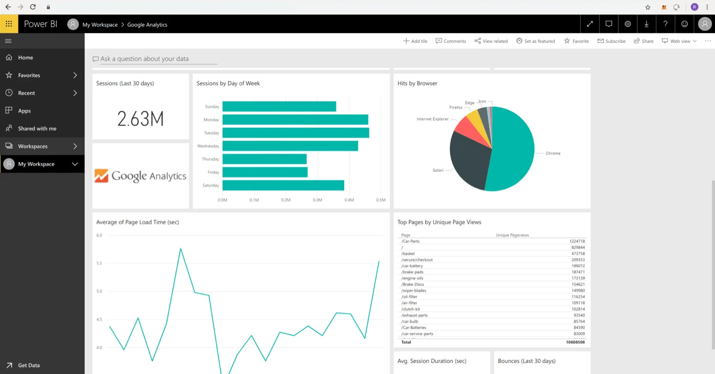
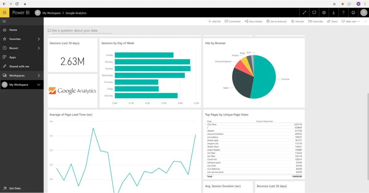
Power BI was used to create near real-time dashboards/reports using the raw data available in different formats which included csv files from the retailer’s database and google analytics data.
2. Processing
Working with Power BI is a 3-step process that starts with cleaning of data and removing all junk/unwanted data, followed by Data Modelling where relationships are defined between the data to be analyzed and finally figuring out the best ways to plot that data such as using bar graphs and pie charts for comparison, scatter plots for distribution and dual axis lines for trends etc.
3. Insights
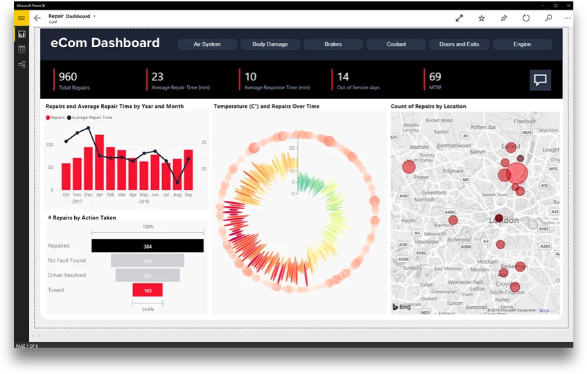
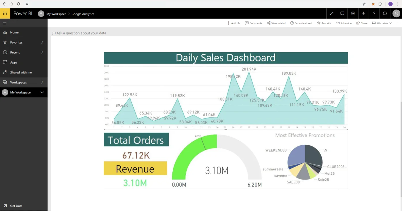
Different dashboards were crafted with drill down capabilities which helped to visually go through important information like:
Sales over the given period of time and its variation by Day/Week/Month
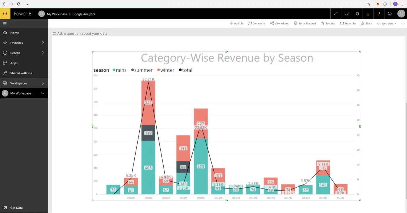
Category wise Revenue by Season which helped draw insights like what items in which product category sold more in winters as compared to summers and this in turn helped the client with better inventory management.
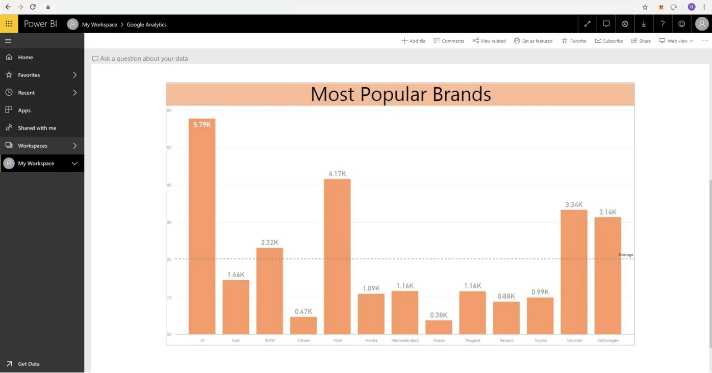
Most popular Brands and how they fare in different areas which can be drilled down starting from country to specific areas.
Customer Demographic Visuals revealed that more than 90% of the buyers are men and hence it helped in targeting marketing.
Created visuals on topics like “Volume by Geography”, another aspect to help plan inventory storage more accurately.
Compared Most Selling VS Most Profitable products that helped business in deciding which products to continue and which products manufacturing may be reduced.
Few static reports were also created for later consumption. Static reports cannot be updated in real time as a dashboard but they can be used to go through the past data at any point in time in future.
We used Power BI Desktop for Loading, Cleaning, Preparing, Visualizing Data and Designing Reports, Power BI Server to publish reports for sharing among the stakeholders and Power BI Mobile App for on the fly access to data and reports shared on Power BI Server.
Data Modelling – Data modeling and relationship building is a complex process of connecting data from multiple sources and requires a detailed analysis and multi-brain validation to figure out how the data is connected. This is required to build relationships between data sources and deciding what kind of visualizations are needed.
Data Visualization: Context, Fitment and Visual Impact
Ever since we started with this data dashboard we kept on learning about new type of graphs and charts that can be used for a particular type of report. We learnt how certain types of visualizations helps in comparatively better understanding of the specific nature of data to some other type of graphs/charts.
In the process of designing our reports to draw insights we iterated multiple times over the selection of right type of visualization to represent the data. As choosing the wrong visual aid or simply defaulting to the most common type of data visualization could cause confusion with the viewer or lead to mistaken data interpretation. To ensure context, fitment and visual impact of chosen visualization, we first questioned ourselves that why we need a chart for a report.
In this process we challenged ourselves for the reasoning behind chosen visualizations and ensured right canvas for data analysis. Points we debated over were:
Did we need to compare values? If yes then where and in which all reports.
Did we need to show composition of something?
Did we need to understand the distribution of our data?
Where and in which all reports we wanted to analyze trends in our dataset?
Business Intelligence: The Desired Impact
The visualizations were a great way of understanding customer’s shopping behavior and helped predict patterns that enable the business to make better business strategies. Insights included customer’s preferences, most popular brands or products, items being viewed multiple times, spike in demand and the time of the year when there is a spike. Festivals like Black Friday and Thanksgiving saw maximum demand due to the holidays and discounts being offered.
Increased focus on customer group targeting, evaluating campaigns & maintaining a competitive advantage, especially during the festive and peak trade season. By analysis and demand forecasting, supply chain management and inventory stocking before the sales period was improved to give optimum discounts, thus increasing the revenue.
The success of any e-commerce business depends on effective customer service. Power BI helped in identifying major issues and resolving them and enhancing their processes so that customers are satisfied with online payments and faster deliveries.
Sharing reports is as important as building them, and Power BI gave several options to share the reports with different stakeholders in different departments. The most useful is the ability to build and publish web dashboards that show key performance indicators and tie them to appropriate visualizations.
The Result
A fully functional data dashboard to inform on Sales & Revenue, Predictive Inventory management and Intelligent marketing through segmented targeting.
Related Success Stories
Results matter. Discover how our customized solutions have delivered measurable business outcomes for clients across various industries. Each case study highlights the
strategic impact of our work, turning challenges into opportunities for growth.
Ask Sol anything about digital products, AI, engineering, or growth, and get answers drawn from years of Net Solutions thinking and experience.
Our assistant helps you find content on our website. By asking a question, you acknowledge that we will process your data in accordance with our Privacy Policy, and consent to anonymous tracking of your conversation to help us improve the experience. Please avoid sharing personal or sensitive information, and close this page if you do not agree to these terms. While we strive for accuracy, AI responses may be inaccurate.By chatting you accept our Privacy Policy and anonymous analytics. Do not share sensitive information. AI answers may be inaccurate.