

The key objective of any eCommerce business is to convert the visitor into a customer and consistently generate sales. However, today’s customers expect nothing less than perfect when it comes to the product as well as the experience of shopping for that product. Navigating the user towards sales consists of various factors – the eCommerce UX (User Experience) design being one of the most important.
A report by Forbes mentions that a better UX design yields up to 400% conversion rates.
What is UX Design?
User experience design (or UX design) is about offering an intuitive, responsive, navigable, and a usable web interface for the website users. All these parameters together add up to make for a seamless shopping experience. For a designer, the objective is to look at the website through an user’s perspective to derive what can give them an easy, logical and a positive website engagement.
If the latest statistics are to be believed, the rise in shopping cart abandonment is a common challenge for many businesses across most categories. And user experience is significantly responsible for this issue. An incoherent or cluttered user experience can eventually reflect on a staggering loss of revenue.
If you think good design is expensive, you should look at the cost of bad design. – Dr. Ralf Speth, CEO, Jaguar Land Rover

We respect your privacy. Your information is safe.
Top 30 eCommerce UX Design Practices to Increase CX
Here are the top 30 mobile eCommerce UX best practices that can help your business effortlessly improve its digital commerce efforts.
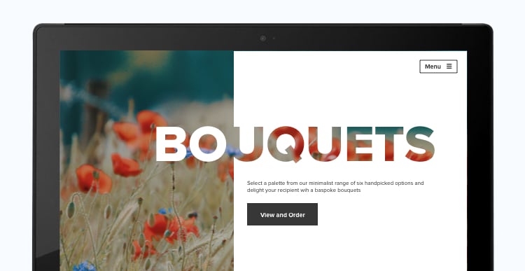
1. Choose Minimalism when Designing the Hero Area
The hero area or feature area is the first visual element a visitor comes across when they click on your eCommerce website. While the design should certainly focus on holding the user’s attention, the presence of attractive animations and 3D graphics to make it interesting might not serve the purpose. The text, images, and other components of the hero page should be easily comprehensible. A minimalist design invariably points towards the product and also offers a more cleaner and high-quality browsing experience.
UX best practices for eCommerce:
- Use a simple, neat, and an uncluttered design.
- Add fewer images and fewer words to the feature area.
- Focus on adding only a single and identifiable CTA (Call to Action).
2. Ensure Convenience with a Well-Positioned Search Bar
Having a working search bar is a primary expectation of any eCommerce website visitor. For most customers, it is an impulsive reaction to locate the search bar when finding a specific product or a service. A well-positioned search bar on the website levels up the usability – most websites add it on the top right of the page for easy eCommerce navigation UX.

Best practices:
- Add a magnifying glass icon that is quite skeuomorphic in its approach.
- Embedding an auto-complete and auto-suggestion option is a smart choice for eCommerce websites.
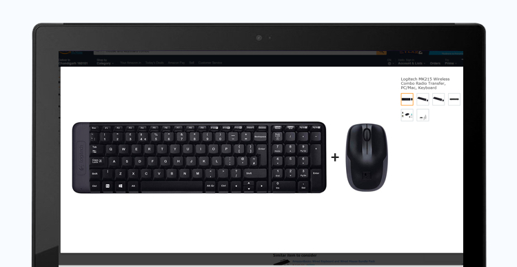
3. Use High-Resolution Product Images
An eCommerce website is centered around the products that it sells – communicated mostly through images. The quality of the pictures straight away defines the quality of the product and, in turn, the sales.
The more you invest in high-resolution images, the better are the chances of that product reaching the checkout section.
Best practices:
- Adding short product explanatory videos engages the user better.
- Close-ups, 360-degree effect, and multiple-angled images can show impressive results.
4. Maintain Accuracy & Clarity of Information
Shoppers today are wiser and smarter than ever. They not just want great products but also expect their shopping experience to be smooth and convenient. Big players in the market achieve this by focusing on a design that helps the user with the necessary information while engaging with the website. It is essential to present critical information in a user-friendly manner while maintaining its natural flow.
Best practices:
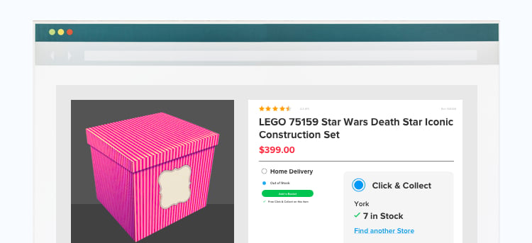
- Display product information, product availability, seller details, and price on the product page itself.
- Delivery and return policy should be easily communicated through a one-touch option.
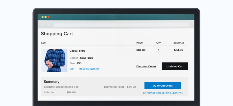
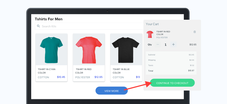
5. Master the Checkout Page
This makes for an essential page for an digital commerce setup as it is the last step of the sales process. Checkout page abandonment is usually high, and hence you can’t afford to make any mistake while designing this page. The section should help users to make the payment and place their order easily and quickly.
UX Design for eCommerce – best practices:
- Include a mini add to cart or shopping cart pop-up that has a clickable link to the main cart page.
- Try and add minimal form fields on the checkout pages as complexity kills the user experience.
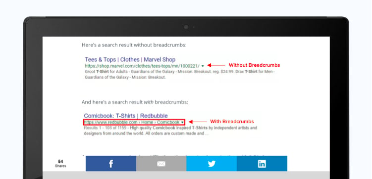
6. Try and Leave Breadcrumbs
When users click on a particular product link, they should be redirected to the exact product page instead of the high-level categorization. This one element can make your eCommerce UX design a successful one.
Leaving such breadcrumbs is not only good for the user but for Google crawlers and SEO too.
Best practices:
- Hyperlink product advertisements and Google links to a particular product page rather than the home page or high categorization.
- Add short names to the UX product pages so that the URL is accurate and less complicated.
We respect your privacy. Your information is safe.
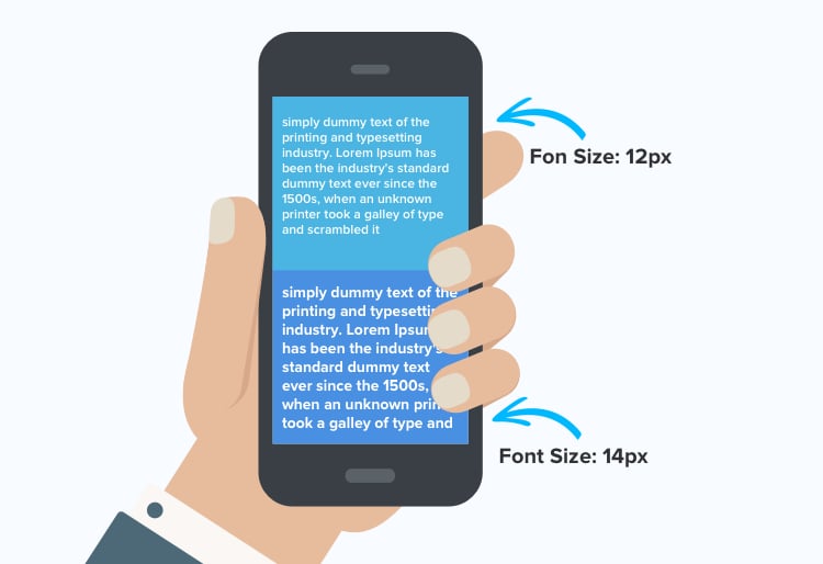
7. Give Preference to Bigger Font Size
The 12 points font has been the most adopted size, however, it can appear too small for your website and especially the mobile user experience. Keeping in mind the current UX design trends, 14 and 16 points are the widely used fonts, making it easy to read on the screen without hurting the eyes.
eCommerce best design practices:
- Make use of a font size calculator to find out the best font for your website.
- Fonts to consider: Open Sans, Ubuntu, Lato, Vollkorn, Arvo, Josefin Slab.
8. Get Rid of Dark Patterns
When a visitor lands on your eCommerce website, they should feel welcomed. Whether it is signing up or making a purchase, it should be a choice and not an obligation. Hence, it would level up the user experience if these dark eCommerce UX patterns are given a miss once and for all.
Best practices:
- Do not make it an obligation for a visitor to sign-up for making a purchase. Shopping as a guest visitor should be allowed.
- Do not mislead the visitors by contradicting the product price on the product page and the checkout page.
9. Horizontal Filter Display is the New in
Most of the eCommerce website designs support a vertical filtering tab that seems to work well so far. But, it is the horizontal filtering options that add convenience and change the face of eCommerce websites. A little change for making things convenient never hurts, and unique web designs do fetch appreciation.
Best practices:
- Designers should pin the horizontal filter so that it appears side by side as the user scrolls.
- Try and cover the entire width of the page as white spaces can make the design look ugly.
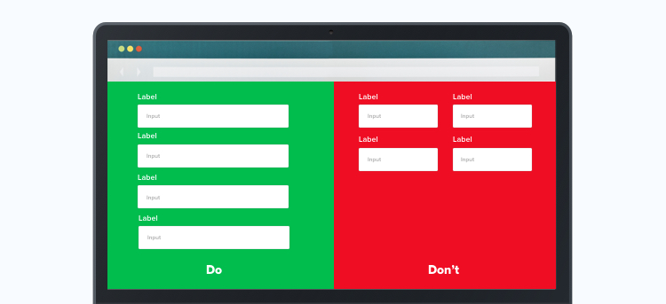
10. Column Structures for Fetching User Data
Adding multiple columns on user entry forms can distort the natural flow of information gathering. Single column structures for sign-ups and checkouts should be preferred because when the user’s eyes move along a single direction, they do not have to figure out which entry to fill up next, thus fewer chances of skipping a field.
Best practices:
- Adding similarly grouped fields (logically similar entities) in multiple columns in a linear fashion is a recommended design practice.
- Do not add unnecessary form fields as it can lead to website abandonment. Rather keep to-the-point form fields and work on automating the entries based on common information.
11. Product Thumbnails are a Must
Adding perfectly sized and clear thumbnails at each and every step (browsing, checkout, review, confirmation emails, order history) of the product identification makes for good design practice.
For a user with multiple orders, it becomes easy to identify orders with visual thumbnails in the cart.

Best practices:
- Keep the thumbnail images consistent across all the major touchpoints. However, the image can be repositioned and resized in accordance with the corresponding page design.
- Try and make the thumbnails smaller when the items in the cart increase. This is helpful as the thumbnails will occupy only the required space without pushing the primary actionable buttons away.
12. Bold Headlines to Grab the Attention
In this highly competitive online space, it has become tricky to grab visitor attention. This is where bold headlines come to rescue and make a web experience stand out. Bolder and highlighted fonts instantly attract attention and aid in boosting the readability of the page.
Best practices:
- Follow the inverted pyramid approach that emphasizes putting the most important information first. This way, you’ll know what content to highlight and why.
- Also, go for larger fonts for bold headlines. It will make the user read the emphasized content first.
13. Welcome Change with Microinteractions
When it comes to enhancing the look and the feel of a product, microinteractions play a significant role. Microinteractions are contained product moments that revolve around a single use case. A fair example of microinteractions is the “Like” button that is exclusive to Facebook. It acts as a medium that helps a user interact with the website design, which, in turn, enhances the user experience big time.
Best practices:
- Add interesting animations to the elements that can be hovered over. As soon as the user moves the cursor on the item, the animation should start playing.
- Bring emotions to your product and landing pages by adding feedback icons that represent likability or disappointment with the product.
14. Focus on Optimizing the Content
Content is king not only for SEO best practices but to maintain visitor attention too. Having the right content strategy in place is a vital step in the UX design process. It is vital to create content that is visually neat and relevant to the context.
Best practices:
- Do not add long descriptive sentences to describe a product. Instead, use short sentences with the 5-7 word or bullet point descriptions.
- Focus on accommodating an acceptable information architecture that lets the users intuitively navigate through the content of the website.
15. Offer an Overall Personalized Experience
The online platform is more and more advanced with time. And the evidence for such advancement lies in the personalized recommendations and emails we receive on our social media accounts based on preferences and browsing history. A common example here is Amazon, which displays similar products at the bottom of a product page. All credits to the machine learning algorithms deployed by eCommerce websites.
Best practices:
- Consider a “Complete the Look” recommendation if you have a fashion website.
- Offer combo recommendations based on similar products or purchase history of distinctively bought products.
16. Thumb Zone for Enhancing Usability
Around 75% of people scroll through their mobile phones with the help of their thumbs. Keeping that in mind, there are certain zones on the phone that are easily accessible by the thumb that are common across mobile devices. Be it left-thumb users, or right-thumb users, placing the actionable elements consciously in this zone is the need of the hour.
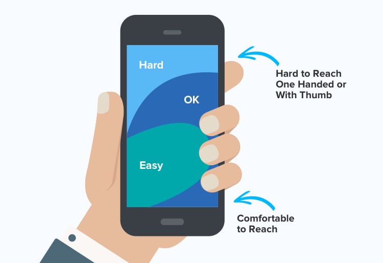
Best practices:
- Place the indispensable elements in the center of the screen, i.e., the natural reach of the thumb.
- Take care of the larger thumb principle that recommends designing larger clickable links in place of tiny ones.
17. Say Yes to Hamburger Icons
Many say that a hamburger icon is an outdated trend, but it is not! The three parallel lines are an ideal compact object that makes categorization easy. Once a user hovers over the icon, a drop-down menu with further details appears. Embed a well-placed hamburger icon, for it makes your design tidy and clutter-less.
![]()
Best practices:
- Add hamburger animations that can make your design stand out from the rest.
- Focus on its effectiveness – clicking or touching a particular menu item should lead to the corresponding dedicated page.
18. Giving Priority To Gesture Controls
In a world where comfort is given high preference, typing and tapping are becoming a thing of the past. Adding gesture controls such as long-press, hold, swap, and drag makes it easy for a user to interact with eCommerce sites. But here’s the catch! You need to add gesture controls cautiously as gesture control sensitivity may ruin the UX.
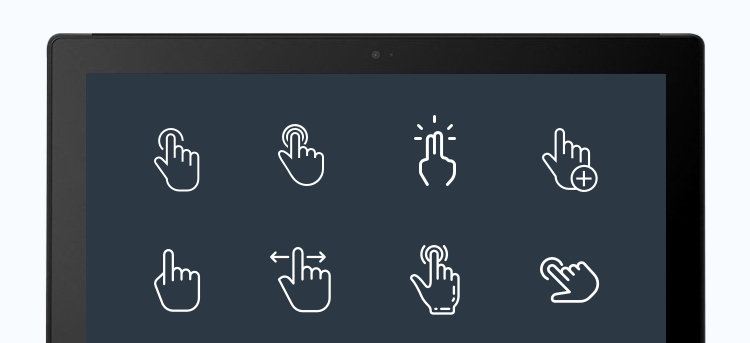
Best practices:
- Accommodate gesture sensitivity all across the screen so that a user can touch anywhere on the screen to trigger the action.
- Make it easy and intuitive to combine gesture controls without hindering a task to complete the process.
- For example “holding” a product, “dragging” it to the cart, and then “releasing” it.
19. Embracing Augmented Reality
Augmented reality is slowly making a mark in the world of eCommerce. It revolves around letting the visitors virtually experience the product so that they can make an informed purchase. An example of such an application is IKEA Place, which allows visitors to see the furniture virtually, play with its color, decor ideas, and a lot more before buying it.
The 2014 IKEA catalogue gives you the ability to place virtual furniture in your own home with the help of augmented reality. Unlock the feature by scanning selected pages in the 2014 printed IKEA catalogue with the IKEA catalogue application (available for iOS and Android) or by browsing the pages in the digital 2014 IKEA catalogue on your smartphone or tablet. Then simply place the printed IKEA catalogue where you want to put the furniture in your room, choose a product from a selection of the IKEA range and see how it will look in your home!
Best practices:
- Try and lock all the elements to the screen space to make for a responsive overall user experience.
- Make the AR experience as simple and clean as possible.
20. Catching up on the Mobile-First Design
Needless to say, a mobile user experience is the most important factor to take care of when designing an eCommerce UX. After all, m-commerce is expected to create 72.9% of eCommerce sales by 2021.
The design of the interface should automatically adjust itself with respect to the device a user is accessing.
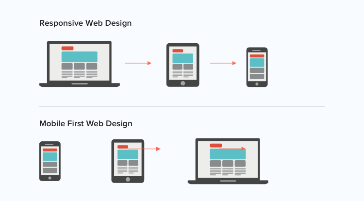
Best practices:
- While a website design displays multiple products on a single page, a mobile-first approach should focus on displaying only 5-10 products on a page.
- Try and accommodate what is functionally and visually essential when designing for the mobile-first interface.
21. Segment Catalogue into Categories
If everything is nicely arranged under categories, buyers can easily locate what they are looking for in seconds. A cluttered page and indefinite headlines can quickly put off a visitor, leading to increased bounce rates.
When designing the categories, it should be a priority to make them easy to locate as well, i.e., it should be placed where the user expects them to be — for example — under a hamburger icon or image banners on the homepage. It is better to undergo user and acceptance testing before finalizing the design.
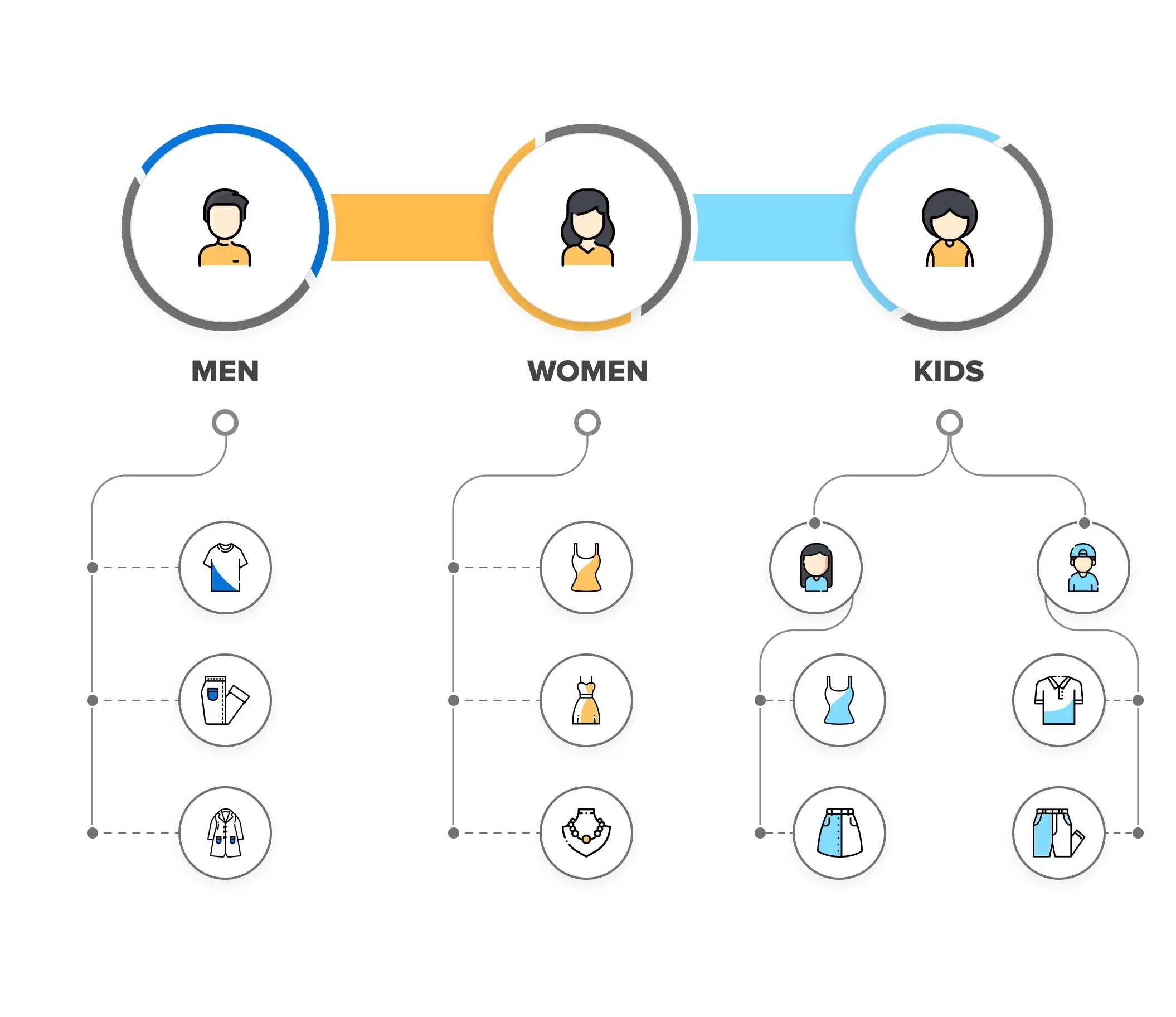
eCommerce UX Design best practices:
- Do add too many categories. Focus on the broad ones, and then you can add sub-categories for arranging further navigation.
- When naming the categories, ensure that the visitor can easily identify and understand them.
- If a particular item fits into different categories, place it under every suitable category. This can further help reduce the search time.
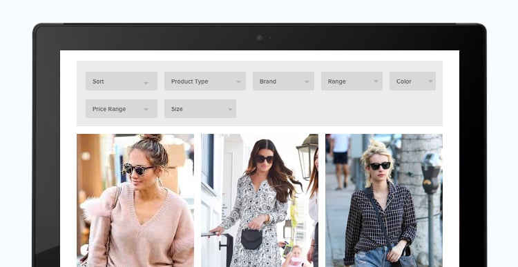
22. Include Relevant Filters and Faceted Search
Filters allow a visitor to narrow down their search based on color, brand, user ratings, etc. Whereas, faceted search adds extensibility and advancement to filters by adding multiple filters for narrowing down the search from among large sets of data.
For example, when you add filters such as brand, color, and price range — these can be called standard filters. On the other hand, in the case of faceted search — filters such as occasion, length, features, and fabric are a part of a faceted search, which appears when a specific and exact category of what is needed is selected.
UX best practices for Filters and Faceted Search:
- Go for the standard filters for the time being. Faceted Search can be expensive and needs more maintenance, and should be included in later stages in the eCommerce web design.
- Do not overwhelm users with too many filters (whether faceted or standard filters). Only focus on the most relevant ones.
- Putting user ratings as a filter makes the products add social proofing and improves the eCommerce user experience. So, do not give a miss to his one.
23. Include Scan-and-Find Feature
The scan-and-find or reverse image search feature is getting popular as it helps users find the exact item they are looking for. For example, a shopper looked for a jacket in a physical store. When they usually look for the same jacket online, it requires a heavy and in-depth search to locate it.
However, with scan-and-find as a part of eCommerce UX design — the shopper can easily scan the image they have with them to find the item in a few seconds. This helps in offering a personalized and omnichannel experience to the customers, while it saves them time.
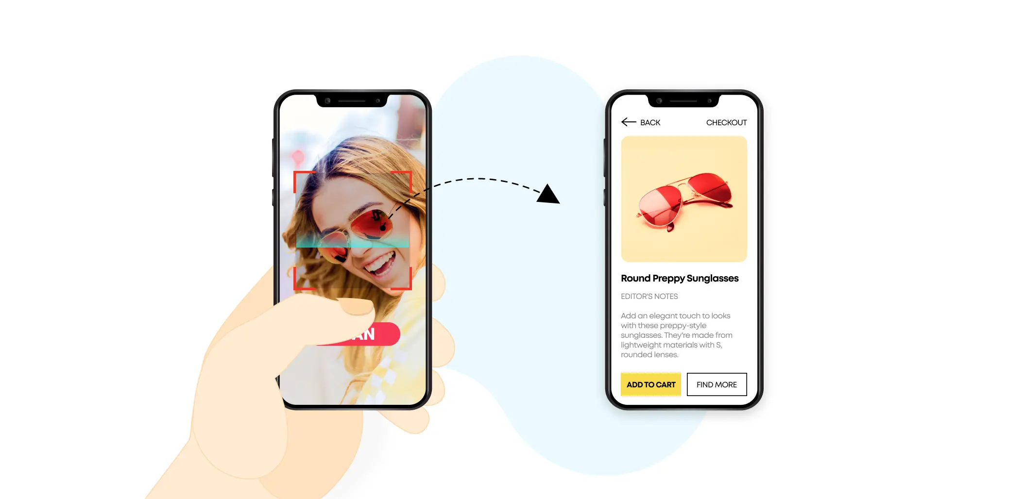
UX best practices for eCommerce:
- Include a scan-and-find feature on the top of the homepage so that the visitors can easily find and use it.
- You can also consider embedding the scan-and-find feature within the search bar itself.
- The scan-and-find feature should be findable, discoverable, usable, prompt, and accurate at the same time.
24. Embed Intentful Call-to-Actions
The purpose of call-to-actions is to increase click-rates and action — it is what leads them one step closer to checkouts. Ensuring that the copies for these call-to-actions are action-centric should be a priority. You should be able to work on three things when working with call-to-actions, i.e., banner copy, image, and linking.
For instance, the home page banners for sale should boldly say “Sale” or “50% OFF. and include a button such as “Shop Now” or “Explore.” Using difficult language and long-phrase lines should be dropped off when designing UX for eCommerce.
UX best practices for eCommerce:
- CTAs can include a sense of urgency, which, in turn, can increase conversions. For example, “50% off. Hurry, only a few left” can be a part of the sale banners.
- Use the right colors for the CTA background image. The background should match the website’s overall design and should be subtle enough so that the text is visible.
- Leave enough white space around the CTAs, so that it delivers the message without confusing visitors with cluttered content.
- Try A/B testing when working with CTAs. This helps test different versions of the copy, which further gives an understanding of what works best for you.
25. Give Preference to Social Proof
Customer reviews and testimonials are considered social proof, which helps persuade visitors to buy. The better and genuine the reviews, the better is the probability that a visitor will make a purchase.
Everyone’s looking for value for money and validity before spending their money, and social proof helps solve the purpose.
Best eCommerce UX Practices:
- You can add the following as a part of social proof — short video testimonials, user ratings, and reviews, shoppers using the eCommerce product videos, or celebrity reviews s a part of influencer marketing.
- Place the user ratings on every product page and included a “trusted reviewer” badge to help buyers ensure that these are genuine reviews.
- Include a clickable, 5-star rating method on top of the page along with the product image. This will help visitors quickly visualize and evaluate social proof scores.
26. Short Videos as Part of Product Information
Videos are becoming quite popular nowadays and are replacing content when it comes to increasing conversions. Many eCommerce websites are adding short videos to the product images sections. These videos are mostly around 30 seconds and depict the use, the looks, and mostly a 360-degree view of the product.
88% of surveyed business owners and eCommerce managers say product page video has increased conversions. — VideoCommerce
UX Design best practices for eCommerce:
- Post high-quality videos that showcase that helps visitors take a closer look at the product.
- Include videos as part of image scrolls and ensure not to post long videos that exceed 30 or at max 40 seconds.
- Include shareable buttons along with videos to enable social sharing for all the videos across the website.
27. Voice-Search Is the New In
With Siri, Alexa, and Cortana’s evolution, voice-search has got very popular as an eCommerce UX trend. The convenience and promptness of voice-search have significantly improved, leading eCommerce websites to invest in the technology.
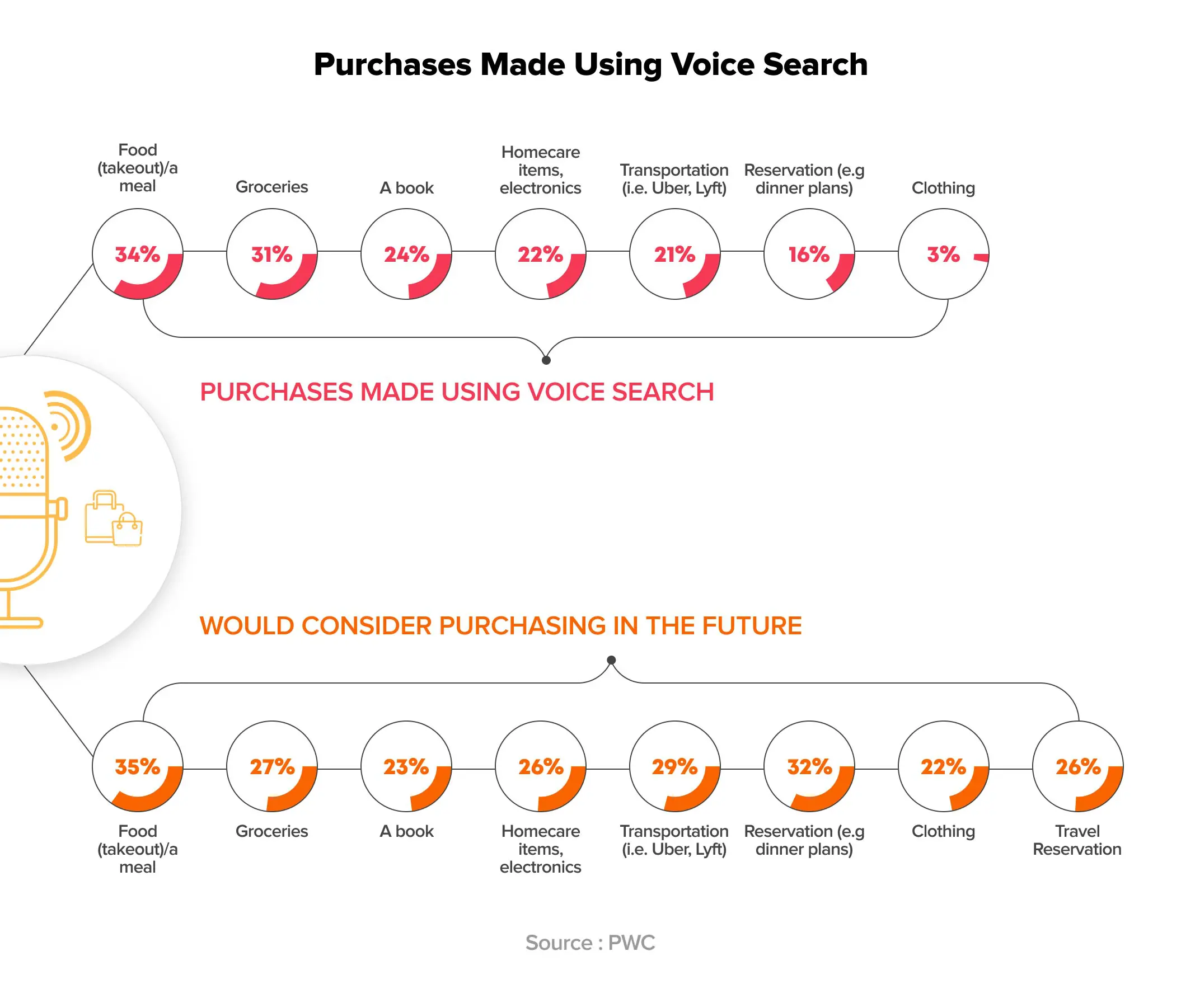
By 2022, 55% of all American households will own a smart speaker with voice shopping hitting $40 billion by the same year. — TechCrunch
Voice-search not only offers a personalized shopping experience but also makes search easily accessible. It also leads the way to smart-shopping and shopping while multitasking.
UX best practices for eCommerce:
- Use natural language as part of voice-patterns. For example, if a user says “show me partywear dresses”, the voice search algorithms should be using such long-tail keywords so that accurate results show up.
- Embed voice-search functionality within the search box itself to avoid confusion. A small microphone should be visible on the right side of the search box to let users know you support voice-search.
28. Chatbots Accompanied by Live Human Support
Chatbots are effective on shopping websites as they promptly answer and tend to user queries. For instance, a user needs to know more about the trending offers or have difficulty finding something, AI built chatbots can assist in getting the right information at the right time.
These days, Facebook Messenger bots are quite popular for increasing sales for eCommerce businesses, like the one by Lego called Ralph.
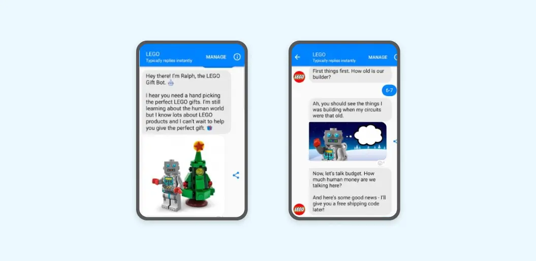
Also, live human support should be embedded with the chatbots as AI still does not have all the answers. If a chatbot is unable to process a query, the session should be transferred onto live human support to help visitors speed up their purchase decisions.
eCommerce UX Best Practices:
- Integrate live chat and AI chatbots in a single minimizable window on every page of the customer journey.
- Keep it conversational and concise. The right way of doing so is to focus on UX microcopy, i.e., short and concise sentences (minus the fluff) that focus on context and action.
- The chatbots should be welcoming and should serve the intent. The clickable buttons should be appropriately linked so that the action matches the user’s intent.
29. Micro UX Animations for Delightful Experiences
Micro UX animations are little animations that appear when a specific action is performed or a particular item is hovered or clicked on. These animations should be a part of your UX design checklist as it improves engagement and interactability.
Some examples of micros UX animations include — image changing with product thumbnails when hovered upon, hover zoom for maximining the view of a specific part of the product, or image icon hovering that shows the product price and add to cart button.
UX eCommerce Best Practices:
- Keep the animations minimal. Adding flashy animations that hurt the eyes can put off a buyer, thus leading to increased abandonment.
- Keep the animations funny, subtle, and clear to the intent. The animation should align with the user’s action as well as the brand’s image.
- Do not create animations that include layouts as it complicates the process of adjusting the animation elements whenever a user logs in with a new device.
30. Designing for Accessibility
A design needs to be inclusive, for which it becomes crucial to design for the disabled too (people having speech, motor, or visual impairments). Moreover, online shopping is more convenient for them if eCommerce websites are designed for accessibility.
If you design for accessibility, you’ll be following the UX design practices properly, and the sales will increase too as you will be covering a large audience now.
UX eCommerce Best Practices:
- Focus on the font size of the text that appears on the website and app. The text should be readable. Also, using high-contrast color combinations enables people with weak eyesight or color blindness to identify and purchase items.
- Use alt tags with every image upload. It gives an idea of what the image is about or what action will be performed in the case of banner images.
- Go for minimalistic, flat design, as flashy designs can hurt the eyes of people with visual disabilities.
Conclusion
An impressive eCommerce website UX and better conversion rates demand best UX principles and design practices. While the factors mentioned in this article work as a handy guide, there are several other details that can contribute to an exceptional eCommerce UX website. Collaborating with a reputed eCommerce web development company or a UX design agency can bring in the relevant expertise to build a website that matches the market expectations. Every business needs a different approach to reach out to its target audience and eventually, its users need to appreciate the experience of interacting with the website. So, start working right away towards a design-focused and customer-centric website.


